day2_packages <- c("scales", "patchwork", "gganimate", "gifski",
                   "plotly", "htmltools",  "leafpop", "leaflet",
                   "mapview", "usmapdata", "usmap", "mapcan", "cancensus",
                   "tidycensus",  "geojsonsf", "tidygeocoder",
                   "rnaturalearthdata", "rnaturalearth", "ggspatial",
                   "terra", "sp", "sf", "gt", "colorspace")

install.packages(day2_packages)Day 2: Maps and Interactivity
Introduction
In Day 2 of our three-day workshop, we will visualise spatial data (i.e., build maps) and exploit interactivity to bring our data visualisations to life. By design, Day 2 will be more hands-off. In other words, there will be less of a focus on “teaching” and more of an emphasis on workshop participants practicing (or honing) their skills in data visualisation. As a result, there will be less prose interspersed throughout this document—but don’t worry, my meandering narration won’t disappear entirely.
As in Day 1, you can engage with course materials via one of two channels:
By following the
day2.Rscript file. This file is available in the companion repository for PopAgingDataViz—UK.1By working your way through the
.htmlpage you are currently on.
A Reminder About Packages (Click to Expand and/or Close)
If renv::restore() is not working for you, you can install Day 2 packages by copying, pasting and executing the following code:
Basic Maps
Thanks to packages like rnaturalearth, we can generate a “world map” in using a few lines of code by (i) drawing on simple features data structures that contain spatial data at a global scale; and (ii) using the geom_sf() function.
ne_countries(scale = "medium",
             returnclass = "sf") |>
# Removing Antarctica from the map ...
filter(!name == "Antarctica") |>
ggplot() +
# The workhorse geom (via sf) to produce maps -- but not our only option:
geom_sf() +
theme_map(base_family = "IBM Plex Sans") +
labs(title = "A Map of the World")
There it is, a map of the world! Of course, we’ll want to produce maps that are much more complex, informative, and aesthetically pleasing. To move in that direction, let’s change how our map is projected onto a two-dimensional plane. In the example below, we opt for the popular Robinson projection of the world.
As in Day 1, you can click most of the images to launch “galleries” that should, in theory, allow you to juxtapose sets of graphics.
ne_countries(scale = "medium",
             returnclass = "sf") |>
filter(!name == "Antarctica") |>
ggplot() +
geom_sf() +
# Changing the coordinate system
# Here, the popular Robinson projection:
coord_sf(crs = st_crs("ESRI:53030")) +
# More projections can be found here:
# https://en.wikipedia.org/wiki/List_of_map_projections
# Search for details here: https://epsg.io/?q=
# Example: orthographic, north pole
#  coord_sf(crs = st_crs("ESRI:102035")) +
theme_map(base_family = "IBM Plex Sans") +
labs(title = "A Map of the World")
Statistical Maps
Data
In Day 2, we will use a range of (mostly spatial) datasets nested within day2.RData. These datasets are summarised in the table below.
| Dataset | Details |
|---|---|
born_data |
Geocoded data on where all workshop participants—and select staff members—from the last two PopAgingDataViz workshops2 were born (anonymised). |
canada_cd |
A GeoJSON file containing Canadian spatial data drawn from Monica Alexander’s Social Media Workshop repository. |
map_data |
Simple features data frame containing spatial data as well as country-year-level indicators from the WDI package. |
province_territory |
Spatial and population data on Canadian provinces in 2017. Data comes from the mapcan package. |
select_countries |
Data on old age dependency and fertility in Canada, Japan, the UK and the US from 1970 to 2020. Constructed using the WDI package. |
london_sf |
A simple features data frame of London drawn from shapefiles and data on ethnicity (at the Lower Super Output Area level) provided by the Greater London Authority. |
oxfordshire_sf |
A simple features data frame of Oxfordshire. Constructed using the eurostat library. |
If you are having issues cloning (or downloading files or folders from) the source repository, you can access the .RData file by:
- Executing the following code in your console or editor:
# Loading the Day 2 .RData file

load(url("https://github.com/sakeefkarim/popaging-dataviz-UK/raw/refs/heads/main/data/day2.RData"))
Or downloading the
.RDatafile directly:
Beyond the data frames listed above, we will generate new datasets in real-time3 by using the tidygeocoder package and calling APIs associated with tidycensus and cancensus. More information will be provided below.
Manipulating Aesthetics, Leveraging Scales
Now, let’s use some of the skills we developed yesterday. To do so, we’ll work with the map_data data frame, manipulate our mapping aesthetics and adjust default scales to produce a map that captures variation in fertility rates around the world.
map_data |>
filter(!name == "Antarctica",
       # For simplicity, isolating 2015:
       year == 2015) |>
ggplot() +
geom_sf(colour = "white",
        linewidth = 0.1,
        # Filling in data as a function of TFR (percentiles):
        mapping = aes(fill = ntile(fertility_rate, 100))) +
# Creating our own gradient scale:
scale_fill_gradient2(low = muted("pink"),
                     high = muted("red")) +
coord_sf(crs = st_crs("ESRI:53030")) +
theme_map(base_family = "IBM Plex Sans") +
labs(title = "A Map of the World",
     fill = "Fertility Rate in 2015 (Percentile)") +
theme(legend.position = "bottom",
      legend.justification = "center") +
guides(fill = guide_colourbar(title.position = "top"))
Quick Exercise (Click to Expand and/or Close)
Try to play around with other variables in the map_data data frame—including, but not limited to, year, age_dependency (old age dependency), fertility_rate, death_rate, net_migration or foreign_share—to produce some new maps. For some inspiration, see the code underlying the plot below—but only after you’ve tried to produce a plot yourself.
Show Code
map_data |>
filter(!name == "Antarctica") |>
drop_na(year) |>
ggplot() +
geom_sf(colour = "white",
        linewidth = 0.05,
        mapping = aes(fill = death_rate)) +
scale_fill_viridis_c(option = "magma", direction = -1) +
facet_wrap(~year, ncol = 2) +
coord_sf(crs = st_crs("ESRI:53030")) +
theme_map(base_family = "Inconsolata") +
labs(title = "Mortality Around the World",
     subtitle = "1990 to 2015",
     fill = "Death Rate (per 1000)") +
theme(plot.title = element_text(size = 15,
                                face = "bold"),
      strip.text = element_text(size = 10),
      legend.position = "bottom",
      legend.justification = "right") +
guides(fill = guide_colourbar(title.position = "top"))
A Brief Detour
In Day 1, we visualised subsets of our data but did not stitch different plots together. With that in mind, let’s take a very quick detour. As noted, facet_* functions allow us to explore and visualise different subsamples of interest. With facet_grid(), we can even produce a grid of plots. However, these plots exist within the same thematic horizon and rely on the same mapping aesthetics. What if we wanted to stitch or combine separate ggplots to tell a more layered (but unified) story?
Below, we use the brilliant patchwork library to bring two distinct plots—i.e., that rely on different themes and map projections—together in a single graphic. In the spirit of simplicity, this exercise draws on map_data to (once again) analyse the uneven distribution of mortality around the world.
mortality_2015_robinson <-  map_data |>
                            # Isolating 2015, removing Antarctica:
                            filter(year == 2015,
                                   !name == "Antarctica") |>
                            ggplot() +
                            geom_sf(colour = "white",
                                    linewidth = 0.05,
                                    mapping = aes(fill = death_rate)) +
                            scale_fill_viridis_c(option = "magma",
                                                 direction = -1) +
                            # Robinson Projection
                            coord_sf(crs = st_crs("ESRI:53030")) +
                            theme_map(base_family = "IBM Plex Sans") +
                            labs(fill = "Death Rate (per 1000)") +
                            guides(fill = guide_colourbar(title.position =
                                                          "top"))

mortality_2015_orthographic <- mortality_2015_robinson +
                               # Orthographic projection
                               coord_sf(crs = st_crs("ESRI:102035"))

two_maps <- mortality_2015_robinson +
            # Adding the two maps together:
            mortality_2015_orthographic +
            # Adding common titles, subtitles:
            plot_annotation(title = "Mortality Around the World in 2015",
                            subtitle = "Per World Bank Estimates") +
            # "Collecting" legends to avoid duplication:
            plot_layout(guides = "collect") &
            # Adjusting base themes:
            theme(legend.position = "bottom",
                  text = element_text(family = "IBM Plex Sans"),
                  plot.title = element_text(face = "bold"))

# If plots are stored as objects, we need to explicitly call
# them to generate a preview:

two_maps
This workshop is about plots, not tables … right? Well, these things are not mutually exclusive—a point recent versions of patchwork cast into sharp relief. For instance, tables can be artfully woven into our data visualisations to tell a more holistic story. Consider a (relatively nonsensical) example where we:
Generate a quick table using the wonderful
gtpackage.Use
patchworkto add this table to two maps of mortality in 2015—each anchored to a unique projection of the globe.
mortality_table <- map_data |>
                   filter(year == 2015) |>
                   as_tibble() |>
                   select(Country = admin, death_rate) |>
                   # Ten lowest death rates in 2015
                   slice_min(n = 10, death_rate) |>
                   gt() |>
                   # Changing label for second column
                   cols_label(2 ~ "Crude Mortality Rate") |>
                   # Retaining two decimals
                   fmt_number(decimals = 2) |>
                   # Column alignment
                   cols_align(align = "center",
                              columns = everything()) |>
                   # Font
                   opt_table_font(font = "IBM Plex Sans") |>
                   # Title
                   tab_header(title = "Lowest Death Rates in the World (2015)") |>                    # Reducing font size
                   tab_options(table.font.size = px(10))

# Stitching maps, table together:

two_maps +
wrap_table(mortality_table,
           # Matches dimensions
space = "fixed") 
Zooming-in on Canada and the UK
Canadian Population in 2017
Let’s produce more statistical maps—this time, zooming-down to a lower level of geographic aggregation: the country-level. Below, we’ll use the province_territories_2017 data frame to produce a map that captures variation in population size across Canadian provinces in 2017.
province_territories_2017 |>
ggplot(aes(x = long, y = lat, group = group)) +
# Notice something?
geom_polygon(mapping = aes(fill = population),
                           colour = "white",
                           linewidth = 0.2) +
# Why'd we switch things up?
coord_sf() +
theme_map(base_family = "IBM Plex Sans") +
theme(legend.position = "top") +
scale_fill_viridis_c(labels = function(x) paste((x)/1000000, "mil"),
                     direction = -1) +
labs(fill = "Canadian Population in 2017") +
guides(fill = guide_colorbar(title.position = "bottom")) +
theme(legend.key.width = unit(0.85, "cm"))
The code above produces a basic map, but it differs from the code underlying our earlier examples in one key way. Can you spot the difference?
Distribution of Non-White Londoners
Let’s shift our focus to where we are today: the United Kingdom. Specifically, let’s draw on london_sf to visualise the spatial distribution of non-white Londoners based on data drawn from the 2011 and 2021 censuses of the United Kingdom.
# A custom, gradient colour palette:

custom_pal <- c("#edf8fb", "#bfd3e6", "#9ebcda",
                "#8c96c6", "#8c6bb1", "#88419d", "#6e016b")

london_sf |>
ggplot() +
geom_sf(aes(fill = non_white), colour = "white",
        linewidth = 0.009) +
facet_wrap(~year) +
scale_fill_gradientn(# Note the inclusion of a custom palette here:
                     colours = custom_pal,
                     # Fill colour for LSOAs with missing data:
                     na.value = "grey80",
                     labels =  function(x) paste0(x * 100, "%")) +
theme_map(base_family = "IBM Plex Sans") +
labs(title = "Spatial Distribution of Non-White Londoners, 2011-2021",
     subtitle = "Data from the 2011 and 2021 UK Census",
     fill = "Non-White Share") +
theme(plot.title = element_text(face = "bold", size = 15),
      plot.subtitle = element_text(colour = "grey50", size = 12),
      strip.text = element_text(size = 11),
      legend.position = "bottom",
      legend.title.position = "top",
      legend.key.width = unit(1, "cm"),
      legend.justification = "centre",
      legend.title = element_text(size = 12, hjust = 0.5),
legend.text = element_text(size = 11)) 
St Hilda’s College and McGill University
To take advantage of the oxfordshire_sf simple features data frame, let’s generate some geolocation data in real-time. To do so, we’ll use the tibble function to create the locations data frame summarised below.
locations <- tibble(site = c("St Hilda's College",
                             "McGill University"),
                    address = c("Cowley Pl, Oxford OX4 1DY",
                                "McGill University")) |>
              geocode(address = address,
                      method = "arcgis")

locations
# A tibble: 2 × 4
site address lat long
<chr> <chr> <dbl> <dbl>
1 St Hilda's College Cowley Pl, Oxford OX4 1DY 51.7 -1.25
2 McGill University McGill University 45.5 -73.6 In a follow-up step, let’s bring in oxfordshire_sf and deploy geom_label_repel() to highlight where we are currently located within Oxfordshire.
oxfordshire_sf |>
ggplot() +
geom_sf() +
# Notice us isolating the first row via the slice function:
geom_point(data = locations |> slice(1),
           mapping = aes(x = long, y = lat)) +
geom_label_repel(data = locations |> slice(1),
                 mapping = aes(x = long,
                               y = lat,
                               label = site))
Finally, we can adjust our colour scheme so that our map is consistent with some of the University of Oxford’s “identifying” colours.
oxfordshire_sf |>
ggplot() +
# Adding Oxford Blue:
geom_sf(fill = "#002147", colour = "white") +
# And "Oxford Green"
geom_point(colour = "#426A5A",
           size = 3.5,
           data = locations |> slice(1),
           mapping = aes(x = long, y = lat)) +
geom_label_repel(family = "Inconsolata",
                 fill = "#426A5A",
                 colour = "white",
                 size = 4.5,
                 nudge_y = 0.02,
                 data = locations |>  slice(1),
                 mapping = aes(x = long,
                               y = lat,
                               label = site)) +
theme_void(base_family = "Inconsolata") +
labs(title = "Oxfordshire, England") 
Question (Click to Expand and/or Close)
Here’s some spatial data zoomed in to the Montréal area.
mtl <- canada_cd |>  ggplot() +
                     geom_sf(colour = "grey")  +
                     theme_void() +
                     coord_sf(xlim = c(-75, -73),
                              ylim = c(45, 47))
With the mtl data frame in hand, try to produce the following plot:
Show Answer
mtl +
geom_point(colour = "#ed1b2f",
           size = 3.5,
           data = locations |> slice(2),
           mapping = aes(x = long, y = lat)) +
geom_label_repel(family = "IBM Plex Sans",
                 fill = "#ed1b2f",
                 colour = "white",
                 nudge_y = 0.15,
                 data = locations |> slice(2),
                 mapping = aes(x = long,
                               y = lat,
                               label = site))
Mapping Census Data
tidycensus
In this section, we’ll call different APIs (via the US Census Bureau and CensusMapper) to download census data4 directly into our session.
We’ll begin by using the tidycensus package to retrieve data from the 2019-2023 American Community Survey.
Below, we’ll explore race-related variables embedded in the latest ACS.
Information about obtaining US Census Bureau and Census Mapper API keys can be found here.
acs_2023 <- load_variables(2023, "acs5")

acs_2023 |> filter(concept == "Race",
                   str_detect(label, "Whit|Tota"))
# A tibble: 10 × 4
name label concept geography
<chr> <chr> <chr> <chr>
1 B02001_001 Estimate!!Total: Race block gr…
2 B02001_002 Estimate!!Total:!!White alone Race block gr…
3 B02001_003 Estimate!!Total:!!Black or African American alo… Race block gr…
4 B02001_004 Estimate!!Total:!!American Indian and Alaska Na… Race block gr…
5 B02001_005 Estimate!!Total:!!Asian alone Race block gr…
6 B02001_006 Estimate!!Total:!!Native Hawaiian and Other Pac… Race block gr…
7 B02001_007 Estimate!!Total:!!Some Other Race alone Race block gr…
8 B02001_008 Estimate!!Total:!!Two or More Races: Race block gr…
9 B02001_009 Estimate!!Total:!!Two or More Races:!!Two races… Race block gr…
10 B02001_010 Estimate!!Total:!!Two or More Races:!!Two races… Race block gr…Let’s say we’re interested in mapping the non-white share of the population in Leon County and Duval County. Moreover, let’s assume we want to shine a spotlight on census tracts. The code below will allow us to (i) quickly retrieve ACS data via tidycensus for both counties; and (ii) generate a census-tract level indicator for our variable of interest (non_white_share).
leon_county <- get_acs(state = "FL",
                       county = "Leon County",
                       geography = "tract",
                       variables = "B02001_002",
                       summary_var = "B02001_001",
                       geometry = TRUE,
                       year = 2023)  |> mutate(non_white_share = 1 -
                                                estimate/summary_est)

duval_county <- get_acs(state = "FL",
                        county = "Duval County",
                        geography = "tract",
                        variables = "B02001_002",
                        summary_var = "B02001_001",
                        geometry = TRUE,
                        year = 2023)  |> mutate(non_white_share = 1 -
                                                 estimate/summary_est)
Now, we can use these simple features data frames to produce maps that illustrate the spatial distribution of ethnoracial minorities in the two counties.
leon_county |>
ggplot() +
geom_sf(mapping = aes(fill = non_white_share),
        colour = "white") +
theme_map(base_family = "IBM Plex Sans") +
scale_fill_viridis_c(guide = guide_legend(),
                     labels = function(x) paste0(x * 100, "%")) +
labs(fill = "Non-White Share",
     title = "Leon County") +
theme(legend.position = "bottom",
      plot.title = element_text(size = 14),
      legend.title = element_text(size = 12),
      legend.text = element_text(size = 11))
duval_county |> ggplot() +
                geom_sf(mapping = aes(fill = non_white_share),
                        colour = "white") +
                theme_map(base_family = "Inconsolata") +
                scale_fill_viridis_c(option = "magma",
                                     labels = function(x) paste0(x * 100, "%")) +
                labs(title = "Duval County",
                     fill = "Non-White Share") +
                theme(legend.position = "bottom",
                      plot.title = element_text(size = 14),
                      legend.title = element_text(size = 12),
                      legend.text = element_text(size = 11))
cancensus
Cool, right? Let’s use cancensus to generate a similar (census-tract-level) map of Montréal. To this end, let’s explore some of the variables we have access to:
explore_census_vectors(dataset = "CA21")Let’s assume we’re interested in v_CA21_4875 — i.e., the “visible minority” indicator. We’ll use this information to (i) retrieve census data via cancensus for Montréal; and (ii) generate a census-tract level indicator for our variable of interest (vm_share).
# Extracting MTL's census code:

mtl <- list_census_regions(dataset = "CA21") |>
       filter(name == "Montréal") |>
       slice(1) |> pull(1)

mtl_data <- get_census(dataset = "CA21",
                       regions = list(CMA = mtl),
                       vectors = "v_CA21_4875",
                       level = "CT",
                       geo_format = "sf",
                       labels = "short")

mtl_data <- mtl_data |>
            mutate(vm_share = v_CA21_4875/Population)
Here, we map the spatial distribution of “visible minorities” in Grand Montréal.
mtl_data |>
ggplot() +
geom_sf(mapping = aes(fill = vm_share),
                      colour = "white",
                      linewidth = 0.01) +
theme_map(base_family = "Inconsolata") +
scale_fill_viridis_c(option = "inferno",
                     labels = function(x) paste0(x * 100, "%"),
                     guide = guide_colourbar(title.position = "bottom")) +
labs(title = "Grand Montréal",
     subtitle = "Data from the 2021 Canadian Census",
     fill = "Visible Minority Share") +
theme(legend.position = "top",
      plot.title = element_text(face = "bold"))
Interactive Maps
leaflet
Let’s step away from ggplot2 for a second. Why? The easiest route to generating dynamic maps in is actually via the wonderful leaflet package.
Here’s how easy it is:
leaflet() |> addTiles()Now, let’s draw on born_data to produce a more informative (and fun) visualisation.
continent_palette <- colorFactor(palette = c("dodgerblue", "red",
                                             "orange", "black", "purple"),
                                 # Corresponding to levels of the
                                 # continent variable:
                                 domain = born_data$continent)

leaflet(born_data) |>
# addProviderTiles(providers$CartoDB.DarkMatter) |>
addProviderTiles(providers$CartoDB.Voyager) |>
addCircleMarkers(lng = born_data$long,
                 lat = born_data$lat,
                 fillOpacity = 0.5,
                 weight = 10,
                 radius = ~ sqrt(n) * 8,
                 color = ~continent_palette(continent),
                 stroke = FALSE)
Quick Exercise (Click to Expand and/or Close)
Use the setView() function to zoom-in to where you were born.
mapview
The mapview package makes it even easier to draw on the power of leaflet. Below, simply providing the oxfordshire_sf data frame takes us to … well, right here!
mapView(oxfordshire_sf,
        color = "white",
        col.regions = "#446f85",
        layer.name = "Oxfordshire")
We can even add pop-ups to add more information (or bells and whistles) to our dynamic maps. To do so, we can use a few of the tools we encountered earlier today as well as the popupIframe function. Make sure to click on the circle on the map!
# Generating coordinates for Oxford:

uoxford <- tibble(site = "University of Oxford",
                  address = "Wellington Square, Oxford OX1 2JD") |>
           geocode(address = address)

# Ensuring that our data is in a "simple features" format:

uoxford_sf <- st_as_sf(uoxford, coords = c("long", "lat"),
                       # WGS84 projection:
                       crs = 4326)

# Here's the popup:

mapView(uoxford_sf,
        color = "white",
        col.regions = "#002147",
        layer.name = "University of Oxford",
        # Size of point:
        cex = 25,
        popup = popupIframe("https://www.youtube.com/embed/lLC75gPigTQ?si=oRqbTPhEuPMZmKQ3",
                            width = 550, height = 300))
Quick Exercise (Click to Expand and/or Close)
Spend a few minutes generating new interactive maps with pop-ups.
More Interactivity: The Return of ggplot2
Now that we’ve produced dynamic plots, let’s return to one of the visualisations we stitched together yesterday — and make it interactive.
Here’s the plot we’ll bring to life:
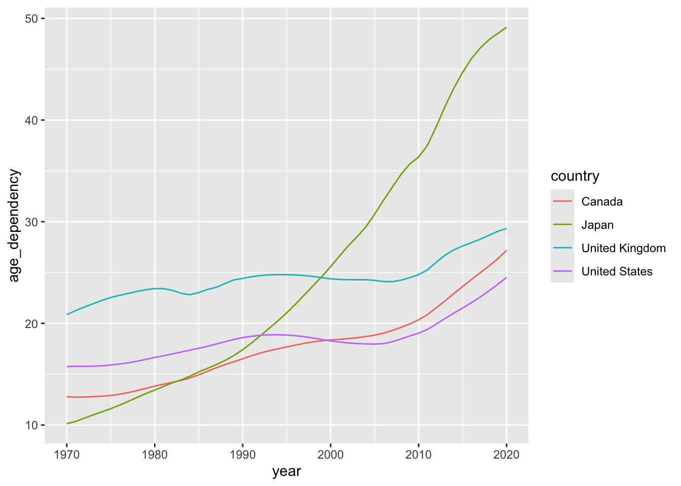
The two tabs below detail different options for developing interactive versions of this basic line plot.
Show Code
old_age_dependency  <- ggplot(data = select_countries,
                              aes(x = year,
                                  y = age_dependency,
                                  colour = country)) +
                       geom_line() +
                       scale_colour_colorblind() +
                       theme_bw(base_family = "Inconsolata") +
                       labs(colour = "",
                            x = "",
                            y = "Old Age Dependency")

select_countries_modified <- select_countries |>
                             # Creating a text "tooltip" for our "hover label"
                             mutate(tooltip = paste(" Country:",
                                                    country, "<br>",
                                                    "Year:", year, "<br>",
                                                    "Old Age Depndency:",
                                                     round(age_dependency, 2)))

old_age_dependency_new  <- ggplot(data = select_countries_modified,
                                  aes(x = year,
                                      y = age_dependency,
                                      text = tooltip,
                                      group = country,
                                      colour = country)) +
                           geom_line() +
                           scale_colour_colorblind() +
                           theme_bw(base_family = "Inconsolata") +
                           labs(colour = "",
                                x = "",
                                y = "Old Age Dependency")

ggplotly(old_age_dependency_new,
         tooltip = "text") |>
# Adjusting the "hover label" and legend:
        # Changes font of tooltip:
layout(hoverlabel = list(font = list(family = "Inconsolata")),
       # Changes legend location
       legend = list(x = 0,
                     y = 1,
                     traceorder = "normal"))
Saving Your Plot
You can save a plot generated via ggplotly by storing your visualisation as an object and then executing the following code:
htmltools::save_html(YOUR-STORED_OBJECT_HERE, "your_plot_name.html")Show Code
old_age_dependency  <- ggplot(data = select_countries,
                              aes(x = year,
                                  y = age_dependency,
                                  colour = country)) +
                                   geom_point() +
                                   geom_line() +
                                   scale_colour_colorblind() +
                       theme_bw(base_family = "Inconsolata") +
                       labs(colour = "",
                            x = "",
                            y = "Old Age Dependency")

old_age_dependency +
transition_reveal(year)
Saving Your Plot
You can save a gganim object as follows:
gif_dependency <- old_age_dependency_alternative + transition_reveal(year)

animate(gif_dependency, height = 8, width = 9, units = "in", fps = 10,
        res = 300)

anim_save("gif_dependency.gif")
Exercises
Use
cancensusortidycensusto produce unique visualisations of cities or counties in North America. To this end, make use of all the skills you’ve picked up over the last two days.Produce a set of unique interactive visualisations. To generate dynamic plots, you may want to draw on the datasets featured in Day 1 and learn more about
plotlyin andgganimate.