day1_packages <- c("systemfonts", "tidyverse", "palmerpenguins", "gapminder",
                   "demography", "LexisPlotR", "ggthemes", "hrbrthemes", "see",
                   "paletteer", "gglgbtq", "colorspace", "lemon", "summarytools",
                   "skimr", "lattice", "tinyplot", "ggrepel", "ggridges",
                   "ggtext", "ggdist", "ggraph")

install.packages(day1_packages)Day 1: Introduction to ggplot2
Introduction
In Day 1 of our three-day workshop, we will cover the basics of plotting using ggplot2 in . Then, we will home-in on a family of visualisations that are often used in population research: heatmaps, Lexis diagrams, and population pyramids. You can engage with course materials via one of two channels:
By following the
day1.Rscript file. This file is available in the companion repository for PopAgingDataViz—UK .1By working your way through the
.htmlpage that you are currently on!
A Note About Packages (Click to Expand and/or Close)
As detailed on the Home page, workshop participants should be able to download all the libraries required for this workshop by simply running renv::restore().
That said, you may run into renv-related issues for a variety of reasons. If this happens to you, fear not — you can install the Day 1 packages by executing the following code:
A Quick Example
Before getting into the theoretical weeds, let’s play around with some data. For this quick example, we’ll be using the palmerpenguins package—and specifically, the penguins data frame. For more information, click here.
Show Code
# Our workhorse package for data wrangling:

library(tidyverse)

# A simple dataset --- on penguins!

library(palmerpenguins)

# The data:

penguins
# A tibble: 344 × 8
species island bill_length_mm bill_depth_mm flipper_length_mm body_mass_g
<fct> <fct> <dbl> <dbl> <int> <int>
1 Adelie Torgersen 39.1 18.7 181 3750
2 Adelie Torgersen 39.5 17.4 186 3800
3 Adelie Torgersen 40.3 18 195 3250
4 Adelie Torgersen NA NA NA NA
5 Adelie Torgersen 36.7 19.3 193 3450
6 Adelie Torgersen 39.3 20.6 190 3650
7 Adelie Torgersen 38.9 17.8 181 3625
8 Adelie Torgersen 39.2 19.6 195 4675
9 Adelie Torgersen 34.1 18.1 193 3475
10 Adelie Torgersen 42 20.2 190 4250
# ℹ 334 more rows
# ℹ 2 more variables: sex <fct>, year <int>We can use other libraries—like skimr—to get better acquainted with our data:
skimr::skim(penguins)Show Output
| Name | penguins |
| Number of rows | 344 |
| Number of columns | 8 |
| _______________________ | |
| Column type frequency: | |
| factor | 3 |
| numeric | 5 |
| ________________________ | |
| Group variables | None |
Variable type: factor
| skim_variable | n_missing | complete_rate | ordered | n_unique | top_counts |
|---|---|---|---|---|---|
| species | 0 | 1.00 | FALSE | 3 | Ade: 152, Gen: 124, Chi: 68 |
| island | 0 | 1.00 | FALSE | 3 | Bis: 168, Dre: 124, Tor: 52 |
| sex | 11 | 0.97 | FALSE | 2 | mal: 168, fem: 165 |
Variable type: numeric
| skim_variable | n_missing | complete_rate | mean | sd | p0 | p25 | p50 | p75 | p100 | hist |
|---|---|---|---|---|---|---|---|---|---|---|
| bill_length_mm | 2 | 0.99 | 43.92 | 5.46 | 32.1 | 39.23 | 44.45 | 48.5 | 59.6 | ▃▇▇▆▁ |
| bill_depth_mm | 2 | 0.99 | 17.15 | 1.97 | 13.1 | 15.60 | 17.30 | 18.7 | 21.5 | ▅▅▇▇▂ |
| flipper_length_mm | 2 | 0.99 | 200.92 | 14.06 | 172.0 | 190.00 | 197.00 | 213.0 | 231.0 | ▂▇▃▅▂ |
| body_mass_g | 2 | 0.99 | 4201.75 | 801.95 | 2700.0 | 3550.00 | 4050.00 | 4750.0 | 6300.0 | ▃▇▆▃▂ |
| year | 0 | 1.00 | 2008.03 | 0.82 | 2007.0 | 2007.00 | 2008.00 | 2009.0 | 2009.0 | ▇▁▇▁▇ |
An Alternative: The
summarytools Package (Click to Expand and/or Close)
library(summarytools)

dfSummary(penguins, method = "viewer") |>
view()| No | Variable | Stats / Values | Freqs (% of Valid) | Graph | Missing | ||||||||||||||||||||||
|---|---|---|---|---|---|---|---|---|---|---|---|---|---|---|---|---|---|---|---|---|---|---|---|---|---|---|---|
| 1 | species [factor] |
|
|
 |
0 (0.0%) | ||||||||||||||||||||||
| 2 | island [factor] |
|
|
 |
0 (0.0%) | ||||||||||||||||||||||
| 3 | bill_length_mm [numeric] |
|
164 distinct values |  |
2 (0.6%) | ||||||||||||||||||||||
| 4 | bill_depth_mm [numeric] |
|
80 distinct values |  |
2 (0.6%) | ||||||||||||||||||||||
| 5 | flipper_length_mm [integer] |
|
55 distinct values |  |
2 (0.6%) | ||||||||||||||||||||||
| 6 | body_mass_g [integer] |
|
94 distinct values |  |
2 (0.6%) | ||||||||||||||||||||||
| 7 | sex [factor] |
|
|
 |
11 (3.2%) | ||||||||||||||||||||||
| 8 | year [integer] |
|
|
 |
0 (0.0%) |
Generated by summarytools 1.1.4 (R version 4.5.1)
2025-08-21
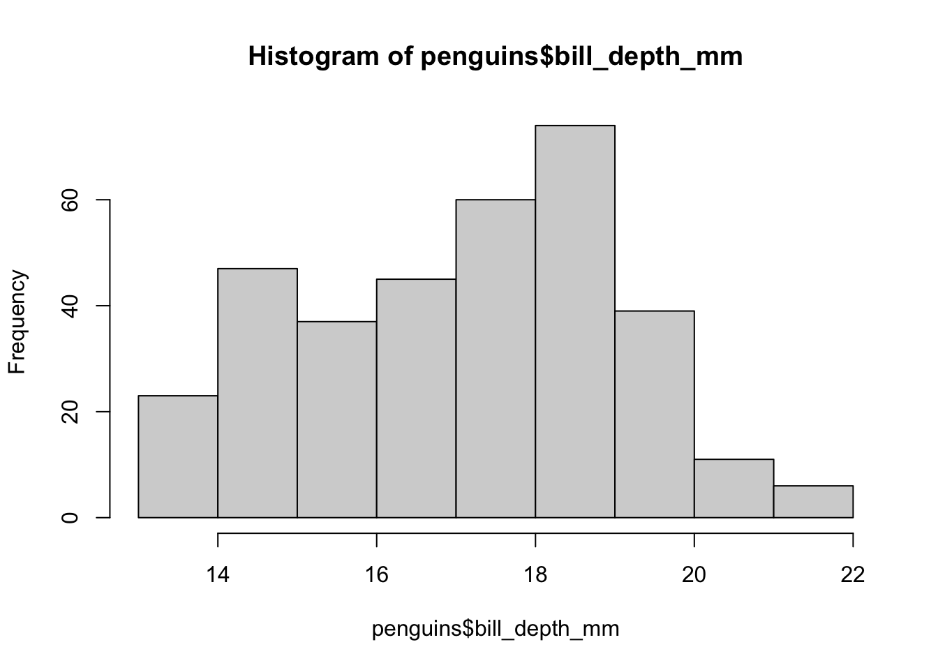
Let’s say we’re particularly interested in the bill_depth_mm variable. To get a better sense of the “story” obscured from view in our data, we may want to explore how this variable is distributed. As a preliminary exercise, let’s review three different ways to visualise this distribution using a histogram.
First, via the base hist() function:
hist(penguins$bill_depth_mm)
Using
tinyplot to Beautify Base Graphics (Click to Expand and/or Close)
tinyplot is an extension of the base graphical system. We can reproduce the previous histogram as follows:
library(tinyplot)

tinyplot(~ bill_depth_mm, data = penguins, type = "histogram")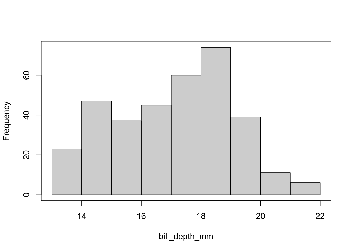
Here’s a very quick example of adding facets—a topic we will explore in depth later today—to base plots while manipulating aesthetics, too:
tpar(family = "IBM Plex Sans")

tinyplot(~ bill_depth_mm | species, data = penguins,
         type = "histogram",
         legend = "none",
         palette = "tableau",
         grid = TRUE,
         facet = ~species,
         facet.args = list(bg = "grey95"))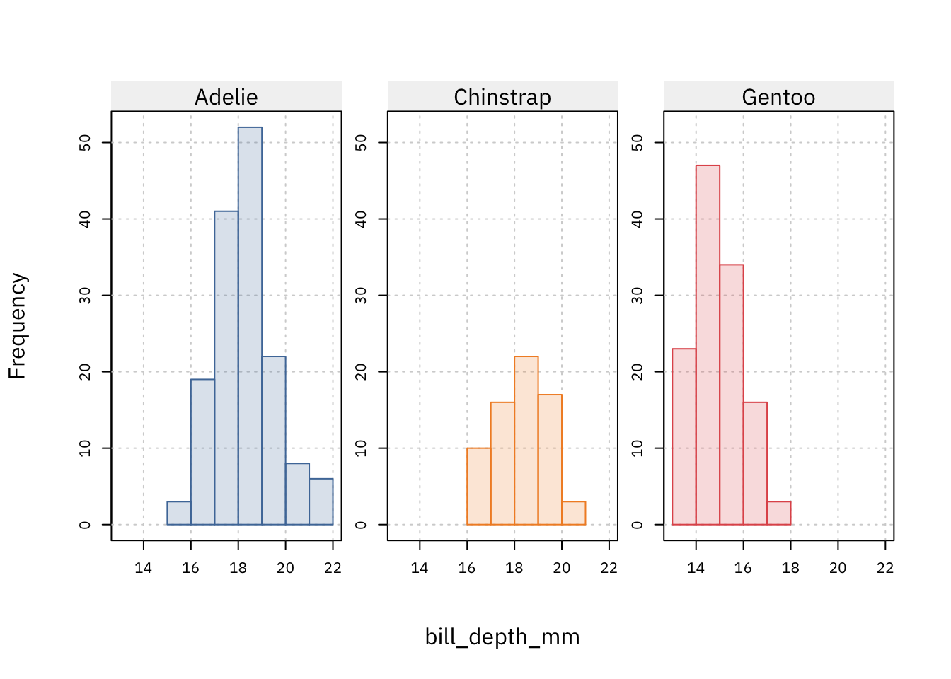
As noted, plotting in base is not the focus of this workshop. For those interested, visit the tinyplot tutorial page.
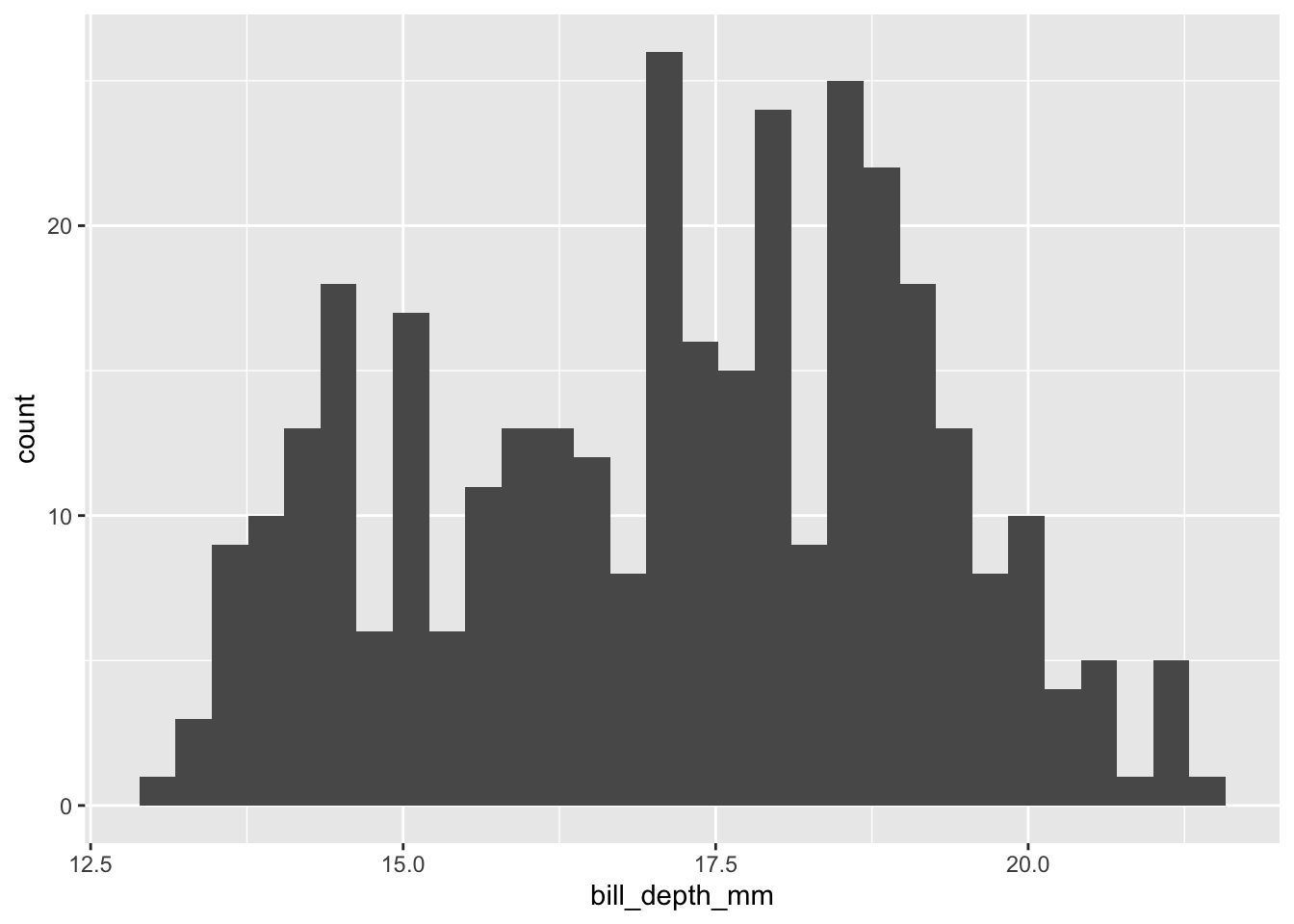
Second, via the lattice library designed by Deepayan Sarkar:
lattice::histogram(~bill_depth_mm, data = penguins)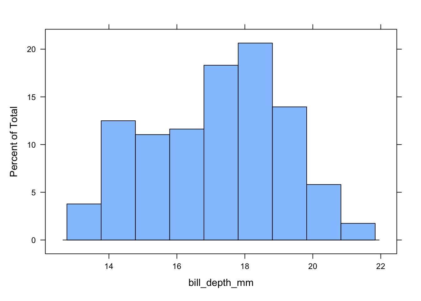
Third, via ggplot2—our workhorse package:
A Quick Question
What are the differences between the three histograms and/or their underlying code?


The Grammar of ggplot2
Unlike many data visualisation libraries, ggplot2 is predicated on a grammar—i.e., the rules, conventions, or precepts that govern a linguistic system (cf. Wickham 2009). In practical terms, this means that ggplot2 users do not have to operate within narrowly-defined (if not arbitrary) parameters or heavily delimited graphical interfaces to produce their plots. Rather, users have the freedom to flexibly stitch together geometric layers, statistical transformations, coordinate systems, scales, facets, and themes to produce unique graphics that are tailored to specific use cases.
What does this mean in concrete terms? We’ll get to that in a second (or two). Before providing more details or exploring more examples, here is a high-level summary of the key building blocks that support ggplot2’s grammar of graphics.
| Component | Brief Explanation | Example |
|---|---|---|
| Data | The statistical information that will be visualised in the plot. | penguins |
| Aes or Aesthetic Mappings |
The mapping of variables in the data to visual layers in the plot. | x or y |
| Geoms or Geometric Objects | The shapes or objects that appear within the plot margins . | geom_point() |
| Stats or Statistical Transformations |
The transformations that summarise elements in our data. | bins |
| Scales | Functions that control how data are translated into layers. | scale_colour_brewer() |
| Coords or Coordinate Systems |
A system that determines how x and y aesthetics are projected. |
coord_cartesian() |
| Facets | Small multiples that highlight different subsets of the data. | facet_wrap() |
| Themes | A way to tune the non-data elements in the plot (e.g., grids). | theme_minimal() |
Now, let’s get better acquainted with each of these components by building some basic visualisations using ggplot2.
Step 1: Data, Aesthetics, Layers
Data
Before we can visualise anything, we need some input data to explore and reimagine. In Day 1, we will draw on a range of datasets nested within day1.RData. These datasets are summarised in the table below.
| Dataset | Details |
|---|---|
aus.fert |
Australian fertility data from 1921 to 2002 — drawn from the demography package. |
can_binned_age |
Data on the sex distribution in Canada from 1971 to 2024. Produced using the cansim package. |
fr.mort |
French mortality data from 1816 to 2006 — drawn from the demography package. |
gapminder |
Country-year-level data from 1952 to 2007. Data comes from the gapminder package. |
mobility_covdata |
Apple Mobility Trends data for London and Montréal between February 2020 to February 2021. Drawn from the covdata package. |
penguins_modified |
Mean of standardised numeric variables in penguins data frame for different species. Drawn from the palmerpenguins package. |
select_countries |
Data on old age dependency and fertility in Canada, Japan, the UK and the US from 1970 to 2020. Constructed using the WDI package. |
select_countries_sex |
Data on population share and life expectancy by sex in Canada, Japan, the UK and the US from 1970 to 2020. Constructed using the WDI package. |
toy_network |
Dummy network data (i.e., an igraph object). Created using the igraph package. |
If you cloned the companion repository for PopAgingDataViz—UK, these datasets should already be available to you locally.
Moreover, if you’re working with the RStudio project nested within the repository, executing the source script associated with Day 1—day1.R—should help you easily work with the data frames described above.
If you do not want to clone the source repository (or are having issues), you can access the .RData file by:
- Executing the following code in your console or editor:
# Loading the Day 1 .RData file

load(url("https://github.com/sakeefkarim/popaging-dataviz-UK/raw/refs/heads/main/data/day1.RData"))
Or downloading the
.RDatafile directly:
Mapping Aesthetics
Within the ggplot2 universe, mapping aesthetics—as specified within the aes() function—serve as hidden bridges that map the variables in our input data to the visual space represented by our graphic.
Mapping aesthetics include, but are not limited to, the positional orientation of data (e.g., x, y, xmin, ymin etc.); the colour or fill of our geoms; and the size and linetype of our visual layers. More information can be found here.
For new users of ggplot2, this might sound a tad abstract. To make things more concrete, let’s quickly look at how aes() mappings help us translate our statistical data into visual signals. For simplicity’s sake, let’s begin with data from gapminder package, a country-year-level data frame with only six variables:
# A tibble: 1,704 × 6
   country     continent  year lifeExp      pop gdpPercap
   <fct>       <fct>     <int>   <dbl>    <int>     <dbl>
 1 Afghanistan Asia       1952    28.8  8425333      779.
 2 Afghanistan Asia       1957    30.3  9240934      821.
 3 Afghanistan Asia       1962    32.0 10267083      853.
 4 Afghanistan Asia       1967    34.0 11537966      836.
 5 Afghanistan Asia       1972    36.1 13079460      740.
 6 Afghanistan Asia       1977    38.4 14880372      786.
 7 Afghanistan Asia       1982    39.9 12881816      978.
 8 Afghanistan Asia       1987    40.8 13867957      852.
 9 Afghanistan Asia       1992    41.7 16317921      649.
10 Afghanistan Asia       1997    41.8 22227415      635.
# ℹ 1,694 more rows
What happens when we only feed ggplot2 our data with no mapping aesthetics?
ggplot(data = gapminder)
What we get is a blank canvas bereft of data. To inject some life into this grey void, let’s add some positional aesthetics to track the ebbs and flows of lifeExp (life expectancy) from the early-1950s to the early aughts:
ggplot(data = gapminder,
       mapping = aes(x = year, y = lifeExp))
The code for this workshop is verbose by design, but you do not have to spell out mapping and data each time you generate a plot. For instance, you can produce the graphic to the left by running:
ggplot(gapminder,
       aes(year, lifeExp))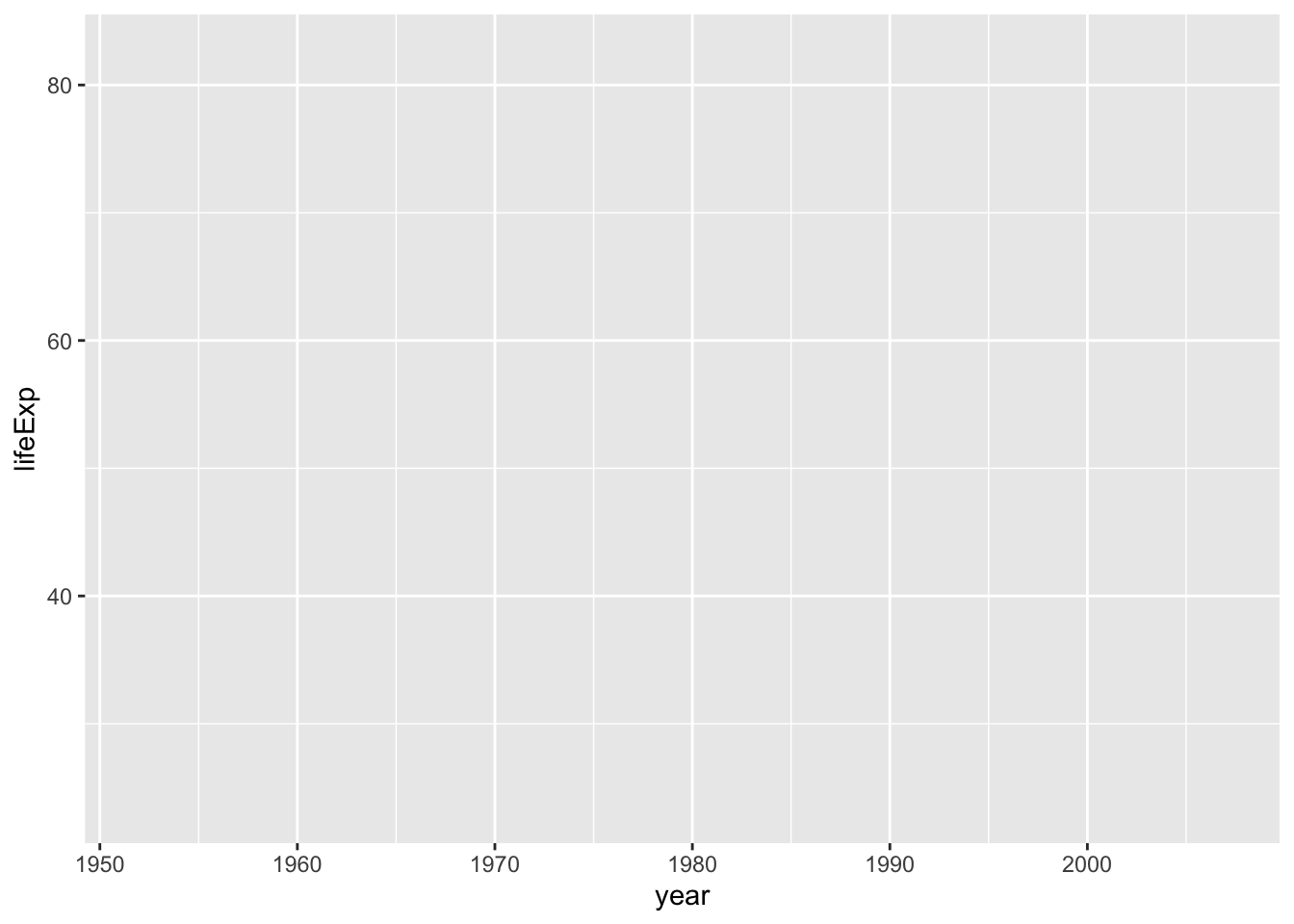
In most cases, it would be prudent to at least include aes(x = ..y = ...) to avoid confusion.
We can now see grid lines, labels for our \(x\)- and \(y\)-axes and so on. However, the significance of mapping aesthetics—and ggplot2 writ large—is difficult to grasp without adding layers (geometric objects, statistical summaries, annotations etc.) to our visualisations. Below, we will begin adding layers to our plots by introducing (and modifying) geometric elements.
Geoms
There are a variety of geometric elements we can use to explore and visualise our data. Here is a list of the geom_* elements that are automatically available when you fire up the ggplot2 package.2
 [1] "geom_abline"            "geom_area"              "geom_bar"
 [4] "geom_bin_2d"            "geom_bin2d"             "geom_blank"
 [7] "geom_boxplot"           "geom_col"               "geom_contour"
[10] "geom_contour_filled"    "geom_count"             "geom_crossbar"
[13] "geom_curve"             "geom_density"           "geom_density_2d"
[16] "geom_density_2d_filled" "geom_density2d"         "geom_density2d_filled"
[19] "geom_dotplot"           "geom_errorbar"          "geom_errorbarh"
[22] "geom_freqpoly"          "geom_function"          "geom_hex"
[25] "geom_histogram"         "geom_hline"             "geom_jitter"
[28] "geom_label"             "geom_line"              "geom_linerange"
[31] "geom_map"               "geom_path"              "geom_point"
[34] "geom_pointrange"        "geom_polygon"           "geom_qq"
[37] "geom_qq_line"           "geom_quantile"          "geom_raster"
[40] "geom_rect"              "geom_ribbon"            "geom_rug"
[43] "geom_segment"           "geom_sf"                "geom_sf_label"
[46] "geom_sf_text"           "geom_smooth"            "geom_spoke"
[49] "geom_step"              "geom_text"              "geom_tile"
[52] "geom_violin"            "geom_vline"
Of course, we won’t have time to go through each of these geoms.3 However, we will explore a few popular geom_* objects in the subsections to follow to produce some standard visualisations: scatterplots, line plots and bar plots.
Scatterplots
Let’s work with gapminder once again. For this example, we’ll shift gears and spotlight the relationship between the log of GDP per capita (gdpPercap) and life expectancy (lifeExp). To make matters easier, we’ll zoom-in on 2007—the latest year included in the gapminder data frame.
ggplot(# Note that we're subsetting the data within the ggplot function:
       data = gapminder |>
              filter(year == max(year)),
       # Here, we're mapping variables in our data to
       # the 'x' and 'y' positions in our plot space:
       mapping = aes(x = log(gdpPercap), y = lifeExp)) +
geom_point(# Adjusts the colour of the points:
           colour = "#002147",
          # Adjusts the size of the points:
           size = 3,
          # Adjusts the transparency of the points:
           alpha = 0.5)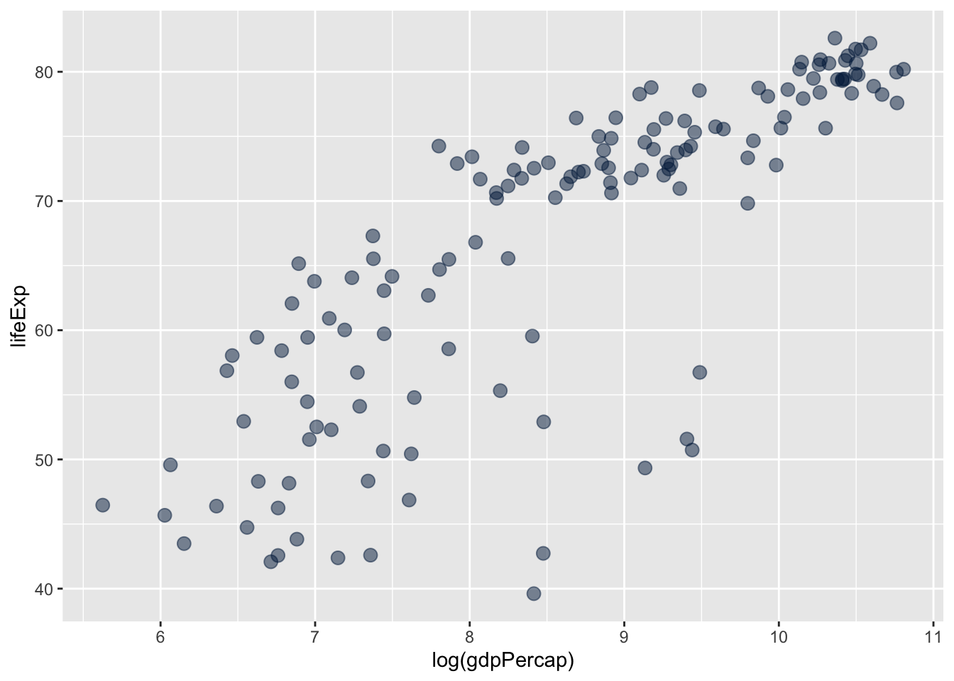
In the plot above, we added a geometric object (points or circles) to our graphic by including the + geom_point() argument. This highlights the core logic of ggplot2 and the grammar of graphics that buttresses it—layers are added sequentially, or in piecemeal fashion, to systematically build visualisations that are tailored to specific research questions or intuitions.
We can now tune or modify the aesthetic attributes of our geom_point() layer. For instance, we can adjust colour within our global aes function to ensure that points are shaded pursuant to the continent variable in our data:
ggplot(data = gapminder |>
              filter(year == max(year)),
       mapping = aes(x = log(gdpPercap), y = lifeExp,
                     # Sets colour globally --- mapping it to the
                     # `continent` variable in the data.
                     colour = continent)) +
geom_point(# Adjusts the size of the points:
           size = 3,
           # Adjusts the transparency of the points:
           alpha = 0.5)
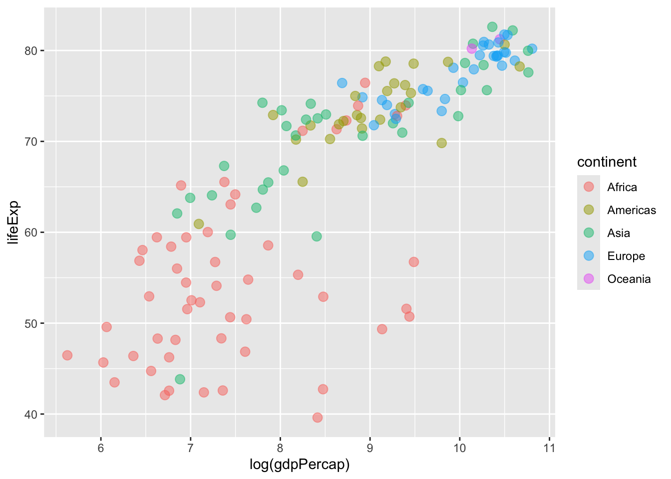
We can also systematically adjust the size of the points or circles in our scatterplot(s). Below, the size of the points in our plot reflects, or is broadly commensurate with, a country’s population in 2007 (logged).
ggplot(data = gapminder |>
              filter(year == max(year)),
       mapping = aes(x = log(gdpPercap), y = lifeExp,
                     colour = continent,
                     # Sets "size" globally--mapping it to the
                     # population variable in the data.
                     size = log(pop))) +
geom_point(# Adjusts the transparency of the points:
           alpha = 0.5)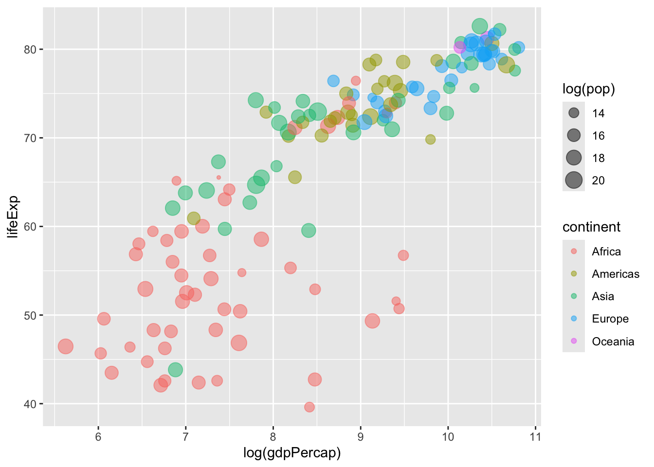
Click on any of the preceding scatterplots to cycle through the different visualisations we created. Alternatively, you can find a bird’s eye view of the plots below.


Question (Click to Expand and/or Close)
How can we adjust the shape of the points in our plot to ensure that they vary as a function of our continent variable?
Show Answer
ggplot(data = gapminder |>
              filter(year == max(year)),
       mapping = aes(x = log(gdpPercap),
                     y = lifeExp,
                     colour = continent,
                     # Include the shape attribute in your aes() call:
                     shape = continent,
                     size = log(pop))) +
geom_point(# Adjusts the transparency of the points:
            alpha = 0.5)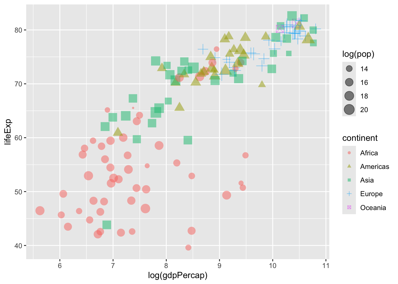
Line Plots
Let’s play around with some of the other data we have at our disposal—specifically, data from select_countries. For a broad overview of the data frame, go ahead and click the button below.
Show Summary Data
| Name | select_countries |
| Number of rows | 204 |
| Number of columns | 4 |
| _______________________ | |
| Column type frequency: | |
| character | 1 |
| numeric | 3 |
| ________________________ | |
| Group variables | None |
Variable type: character
| skim_variable | n_missing | complete_rate | min | max | empty | n_unique | whitespace |
|---|---|---|---|---|---|---|---|
| country | 0 | 1 | 5 | 14 | 0 | 4 | 0 |
Variable type: numeric
| skim_variable | n_missing | complete_rate | mean | sd | p0 | p25 | p50 | p75 | p100 | hist |
|---|---|---|---|---|---|---|---|---|---|---|
| year | 0 | 1 | 1995.00 | 14.76 | 1970.00 | 1982.00 | 1995.00 | 2008.00 | 2020.00 | ▇▇▇▇▇ |
| age_dependency | 0 | 1 | 21.33 | 7.31 | 10.14 | 16.77 | 19.35 | 24.32 | 49.13 | ▅▇▁▁▁ |
| fertility_rate | 0 | 1 | 1.75 | 0.23 | 1.26 | 1.63 | 1.76 | 1.86 | 2.48 | ▃▆▇▃▁ |
Let’s say we want to visualise how old-age dependency (age_dependency) has evolved over time for each of the nation-states (Canada, the United States, the United Kingdom, Japan) featured in our data.
To kick things off, let’s generate a simple plot that draws on the geom_line() function.
ggplot(data = select_countries,
       aes(x = year,
           y = age_dependency,
           # This ensures that we produce unique lines for each country.
           group = country)) +
geom_line(colour = "dodgerblue",
          linetype = "dashed")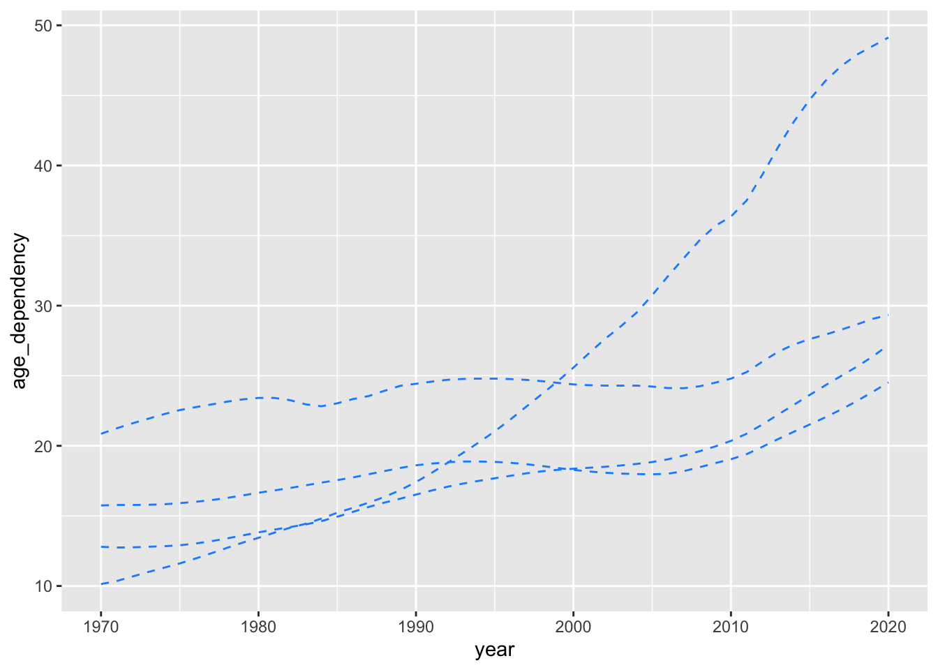
Here’s what would happen if we didn’t modify the group aesthetic.
ggplot(data = select_countries,
       aes(x = year,
           y = age_dependency)) +
geom_line(colour = "dodgerblue",
          linetype = "dashed")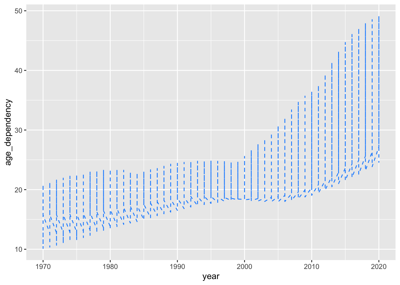
We’ve produced four unique trajectories, but we don’t know what these trajectories mean (or which countries these disparate trajectories correspond to). With that in mind, how can we produce the plot embedded below?
Show Code
ggplot(data = select_countries,
       aes(x = year, y = age_dependency,
           # Sets colour to country:
           colour = country)) +
geom_line(linetype = "dashed")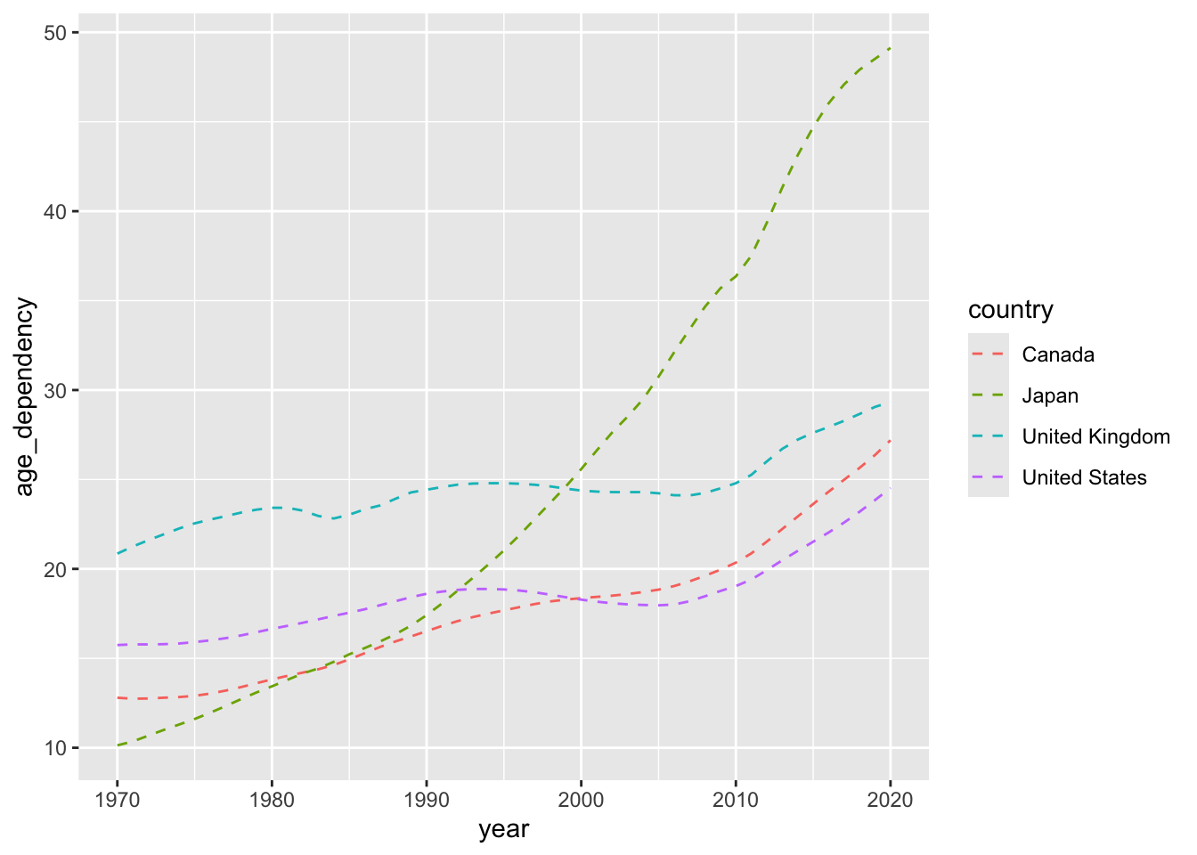
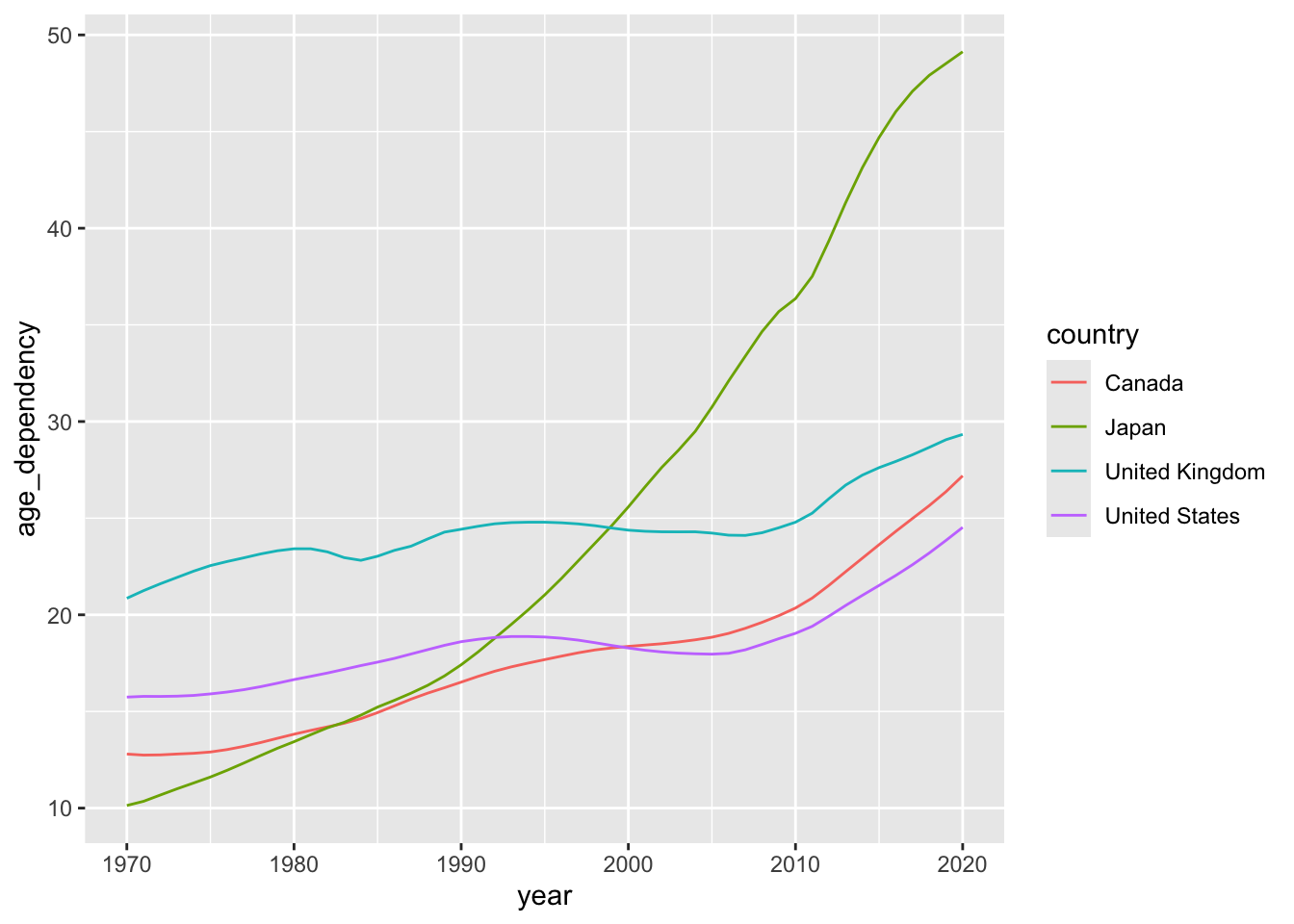
We can also ensure that our linetypes vary as a function of the country variable:
ggplot(data = select_countries,
       aes(x = year, y = age_dependency,
           colour = country,
           # Sets linetype to country as well:
           linetype = country)) +
geom_line()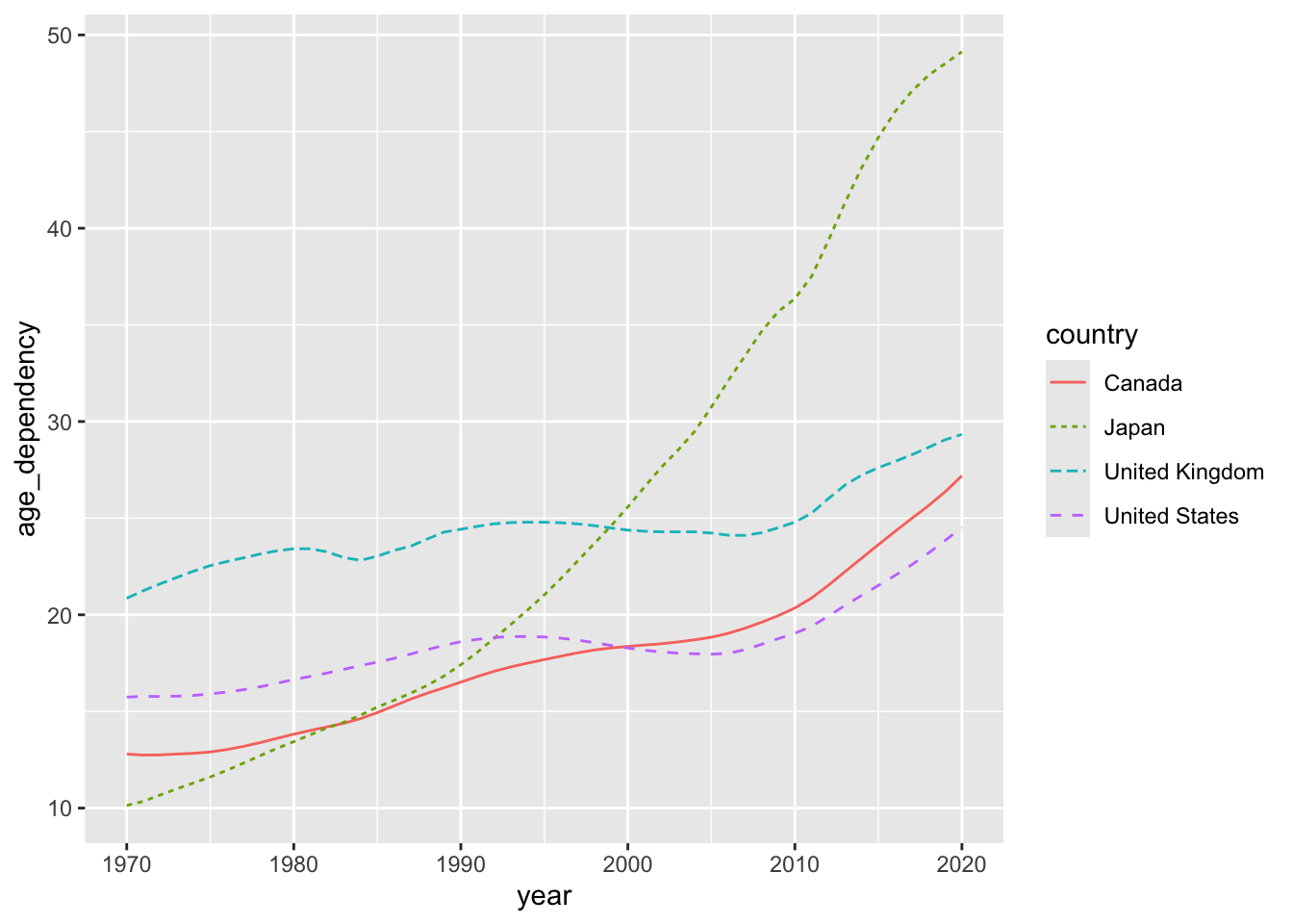
To compare and contrast the line plots we just produced, either click one to launch a gallery or inspect all three from a bird’s eye perspective:


Question (Click to Expand and/or Close)
How can we adjust the linewidth of the trajectories in our plot to ensure that they vary as a function of our fertility_rate variable?
For this exercise, do not include a linetype argument in your aes() call.
Show Answer
ggplot(data = select_countries,
       aes(x = year, y = age_dependency,
           colour = country,
           # Ensures that the width of the line varies by TFR:
           linewidth = fertility_rate)) +
geom_line()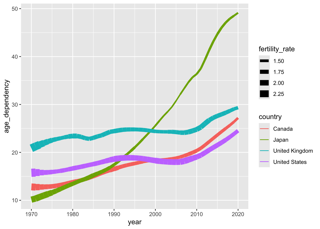
Bar Plots
Bar plots are not the most exciting visualisations in the world.4 That said, they tend to punch above their (aesthetic) weight and provide a decent amount of utility—i.e., you don’t need to know much programming or score high on numeracy to understand the “story” that bar plots are conveying.
To produce a few basic bar plots in ggplot2, let’s use the select_countries_sex data frame. For an overview of the data frame, click the button below.
Show Summary Data
| Name | select_countries_sex |
| Number of rows | 408 |
| Number of columns | 5 |
| _______________________ | |
| Column type frequency: | |
| character | 2 |
| numeric | 3 |
| ________________________ | |
| Group variables | None |
Variable type: character
| skim_variable | n_missing | complete_rate | min | max | empty | n_unique | whitespace |
|---|---|---|---|---|---|---|---|
| country | 0 | 1 | 5 | 14 | 0 | 4 | 0 |
| sex | 0 | 1 | 4 | 6 | 0 | 2 | 0 |
Variable type: numeric
| skim_variable | n_missing | complete_rate | mean | sd | p0 | p25 | p50 | p75 | p100 | hist |
|---|---|---|---|---|---|---|---|---|---|---|
| year | 0 | 1 | 1995.0 | 14.74 | 1970.00 | 1982.00 | 1995.0 | 2008.00 | 2020.00 | ▇▇▇▇▇ |
| pop_share | 0 | 1 | 50.0 | 0.93 | 48.21 | 49.27 | 50.0 | 50.73 | 51.79 | ▆▇▆▇▆ |
| life_expectancy | 0 | 1 | 77.6 | 4.40 | 67.10 | 74.70 | 78.1 | 80.60 | 87.71 | ▂▅▇▆▂ |
Once again, we’re going to elide the complexity of visualising multidimensional, time-varying data by isolating the latest year in the data frame (2020)—but fear not: many of the examples to come will highlight evolutionary or diachronic processes.
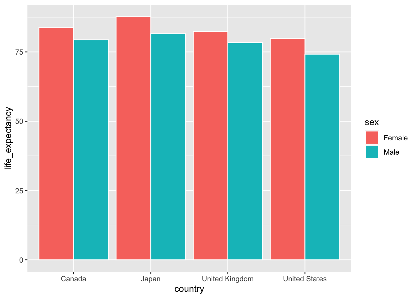
For now, let’s begin by producing a bar plot that highlights sex differences in life expectancy in Canada, the United States, the United Kingdom, and Japan.5
ggplot(data = select_countries_sex |>
              filter(year == max(year)),
       mapping = aes(x = country, y = life_expectancy,
                     # To produce different quantities along
                     # the lines of sex:
                     group = sex)) +
geom_col(# To ensure that bars are placed
         # side-by-side --- and not stacked!
         position = "dodge",
colour = "white") 
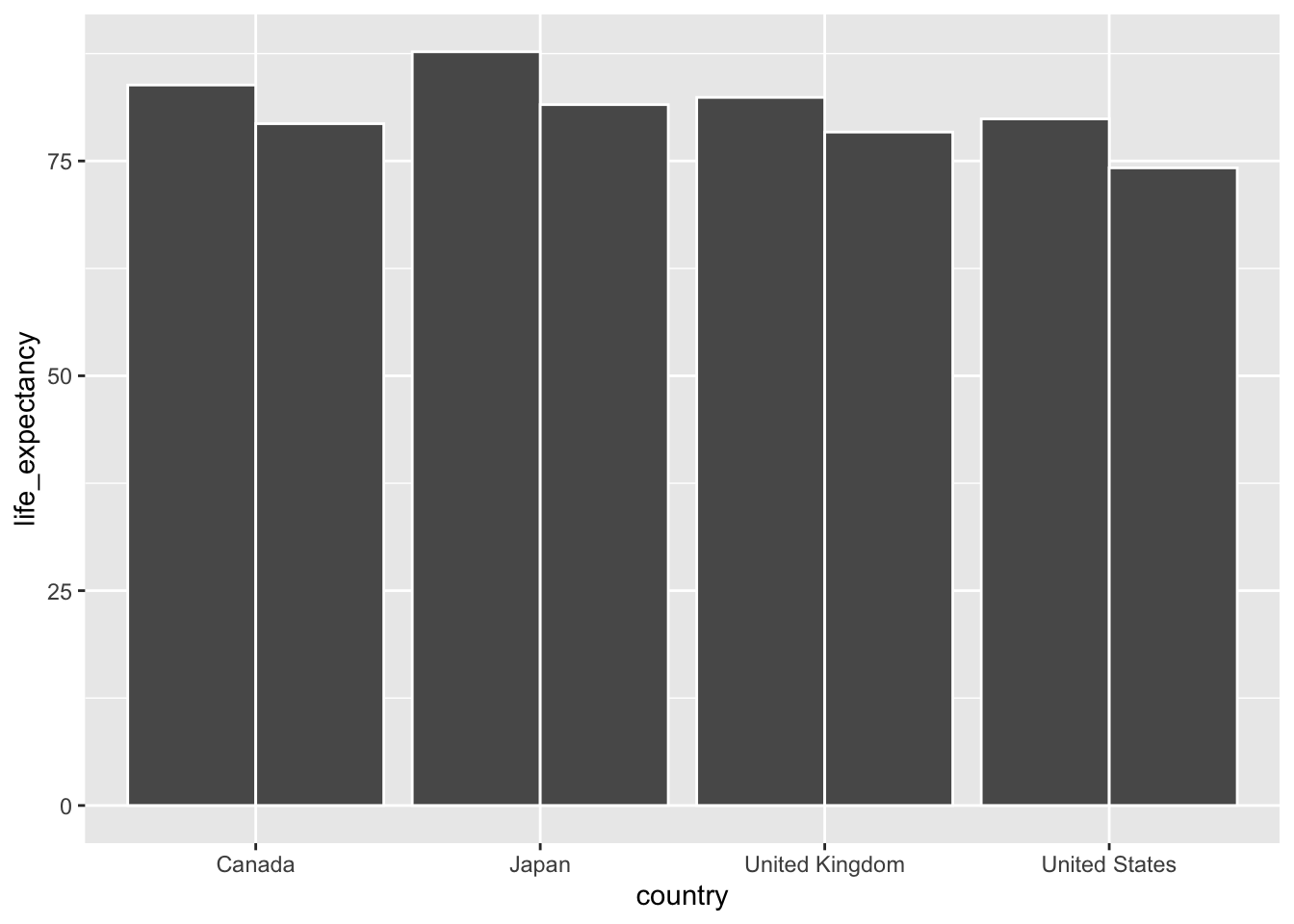
Here’s what would happen if our position argument was left alone.
ggplot(select_countries_sex |>
       filter(year ==
              max(year)),
       aes(x = country,
           y = life_expectancy,
           group = sex)) +
geom_col(colour = "white") 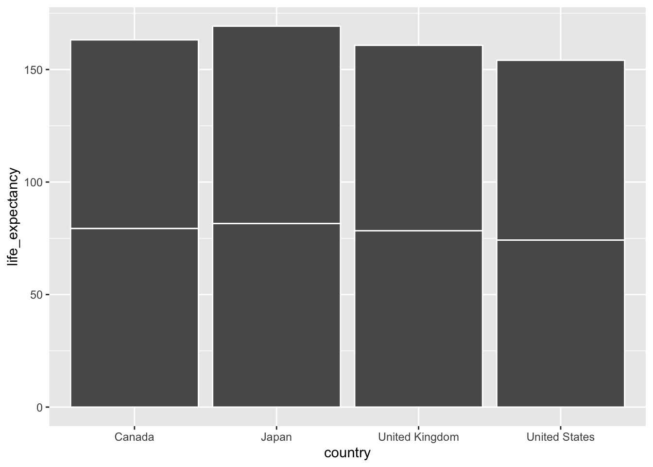
Now, let’s clarify what the two bars (per country) actually represent. How can we do this in a straightforward manner? There are a bevy of options. We could, for instance, set our label aesthetic to sex and use geom_text() or cognate geoms.
An even simpler approach is shown below: here, we simply change the fill of our bars so they correspond to the sex variable in our input data:
ggplot(data = select_countries_sex |>
              filter(year == max(year)),
       mapping = aes(x = country,
                     y = life_expectancy,
                     # Ensuring that the colour inside the bars
                     #  (the "fill") varies by sex:
                     fill = sex)) +
geom_col(position = "dodge",
         colour = "white")
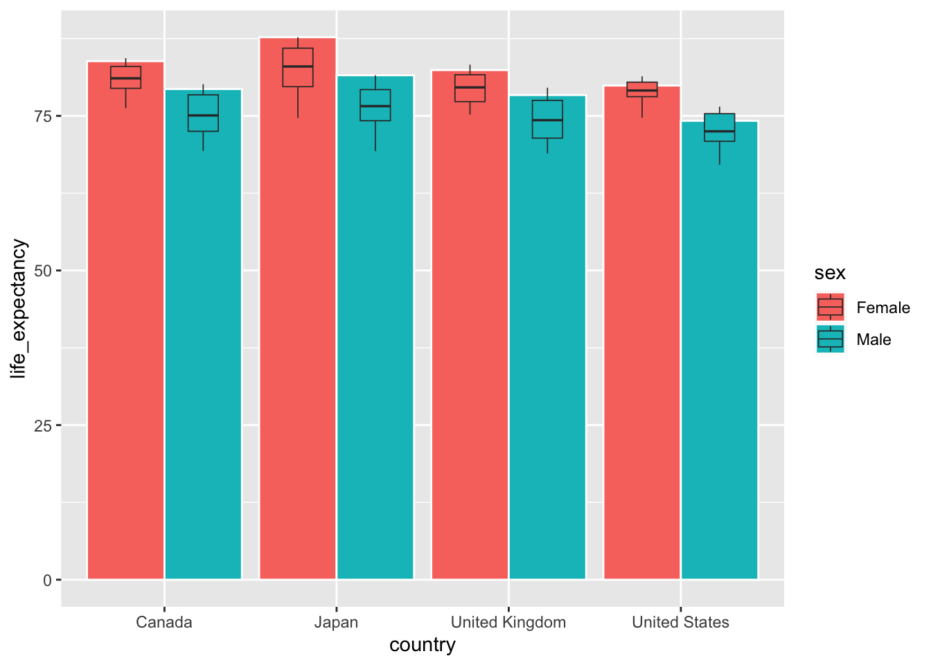
Let’s introduce a bit more complexity. To do so, we’ll produce a graph that is not going to win any awards (and certainly no Dragon’s Den trophies), but is interesting.6 Here’s what we’ll do to generate the graph in question:
Reproduce the bar plot from above — which illustrates sex differences in life expectancy across four countries in the year 2020.
In the same plot, display the distribution—or the peaks and valleys—of life expectancy for females and males across these four countries in the last half century (1970-2020).
While this may seem prima facie complicated, all we have to do is add a geometric layer to our data. In this case, we’ll add geom_boxplot() to illustrate distributions of life expectancy from 1970 to 2020.
What do you notice about the arguments within the geom_boxplot() function?
ggplot(data = select_countries_sex |>
              filter(year == max(year)),
       mapping = aes(x = country, y = life_expectancy,
                     fill = sex)) +
geom_col(# Allows for more fine-grained control of
         # the space between bars:
         position = position_dodge(width = 0.9),
         colour = "white") +
geom_boxplot(linewidth = 0.3,
             width = 0.35,
             # Space between boxplots constrained to
             # be equal to space between bars:
             position = position_dodge(width = 0.9),
             # Using original data frame that
             # has not been subsetted.
             data = select_countries_sex)
You know the drill by now: click any of the bar plots (from above) to launch a gallery or review all three visualisations below:
Question (Click to Expand and/or Close)
How can we produce the following bar plot?
Show Answer
ggplot(data = select_countries_sex |>
              filter(year == max(year)) |>
               # Rearranging the order of the discrete
               # y-axis labels using forcats functions:
              mutate(country =
                      fct_rev(fct_relevel(country,
                                          "Canada",
                                          "United States",
                                          "United Kingdom"))),
       mapping = aes(# Note the inversion of the x and y axes:
                     x = life_expectancy,
                     y = country,
                     fill = sex)) +
geom_col(position = "dodge",
colour = "white") 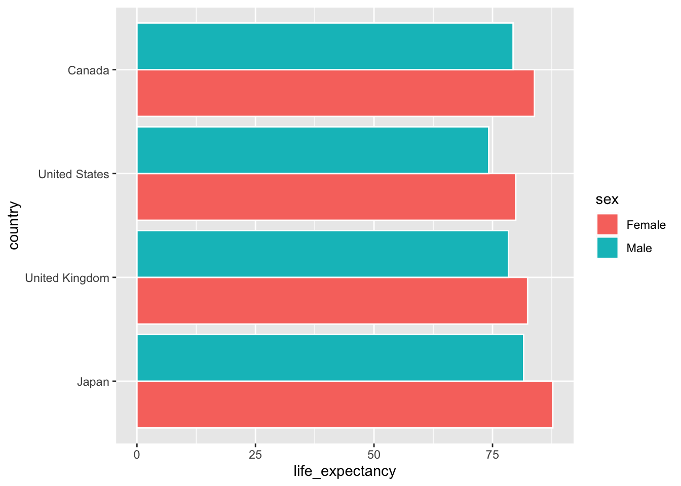
Stats
Most of the plots covered thus far feature an explicit mapping of variables to visuals: more precisely, what you’ve seen within the plot margins has, more often than not, been an explicit, 1:1 summary of the input data.7 However, many of the geoms available in ggplot2 feature statistical transformations of the inputs to ease interpretation of the relationships between variables. This is covered in some detail in Chapter 13 of Wickham et al. (2023).
For our purposes, we’ll focus on a couple of statistical transformations and associated functions. To this end, we’ll work with some new geoms that are powered by stat_* functions under the hood.
Note (Click to Expand and/or Close)
You can, of course, work with stat_* functions themselves. Statistical summaries are particularly useful — and can be added as new geometric layers via the stat_summary() function. Here’s a quick example using gapminder:
Show Code
ggplot(data = gapminder |>
       # Zeroing in on latest year and removing Oceania
       # which has only two observations:
       filter(year == max(year)),
       aes(x = continent, y = lifeExp)) +
geom_point(colour = "lightgrey") +
stat_summary(fun.data = "mean_cl_boot",
             colour = "skyblue",
             linewidth = 2,
             size = 1)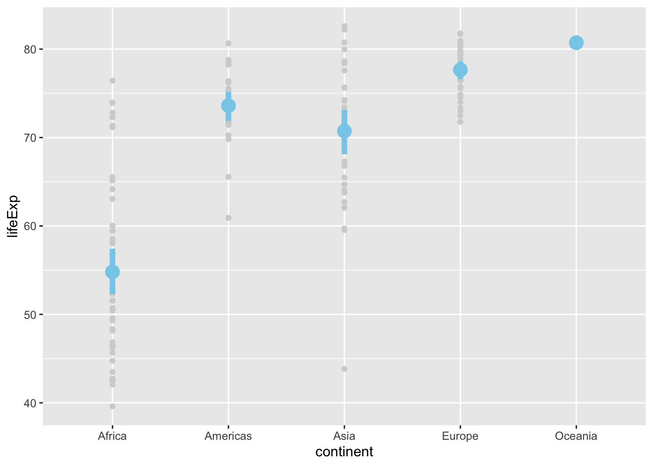
Smoothed Conditional Means
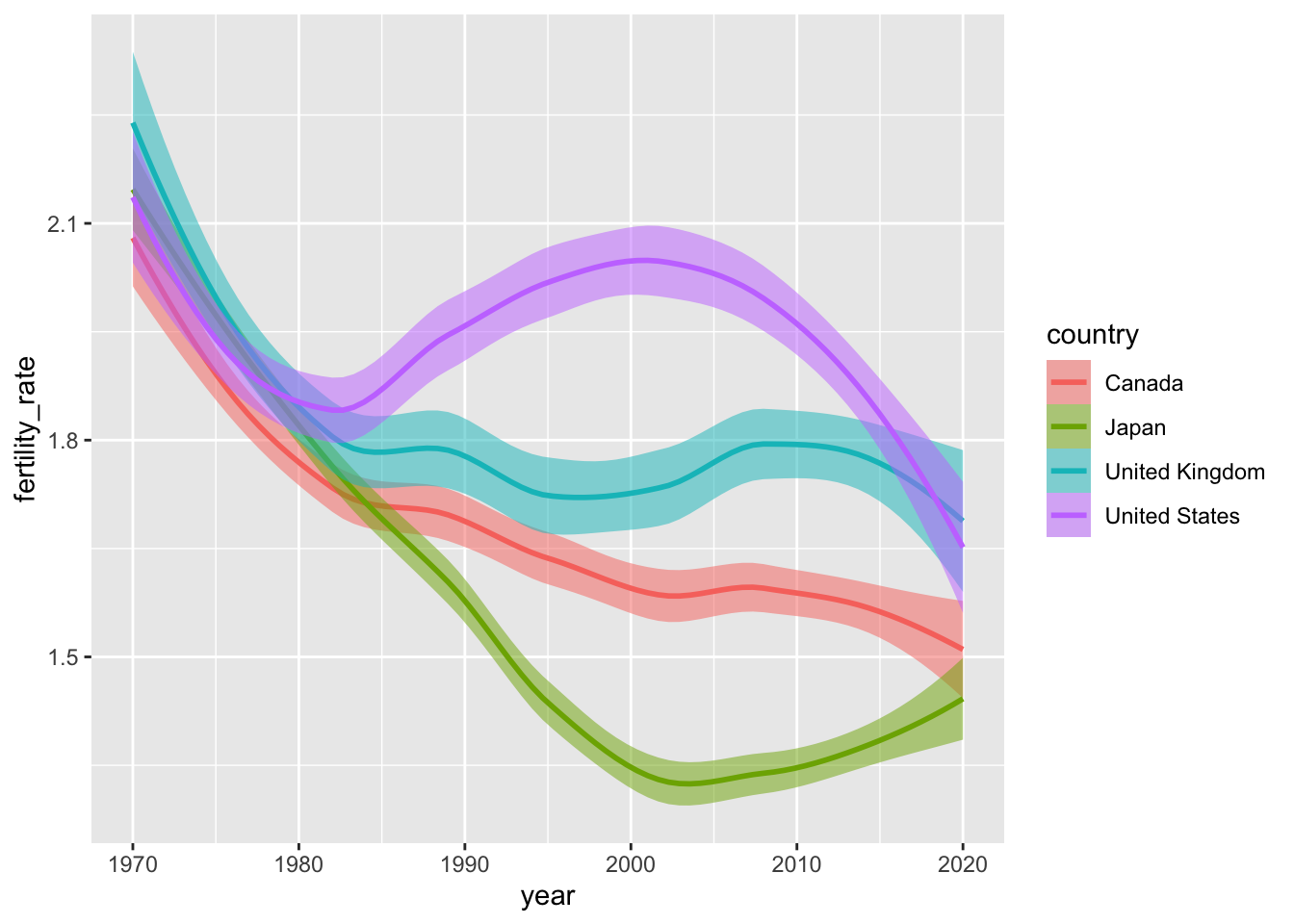
Smoothed conditional means are powerful safegaurds against overplotting. To get a sense of their utility, let’s look at some fertility data from the select_countries data frame. Specifically, we’ll begin by visualising how the fertility rate has evolved over time in Canada, the United States, the United Kingdom and Japan.
ggplot(data = select_countries,
       mapping = aes(x = year,
                     y = fertility_rate,
                     colour = country)) +
geom_line()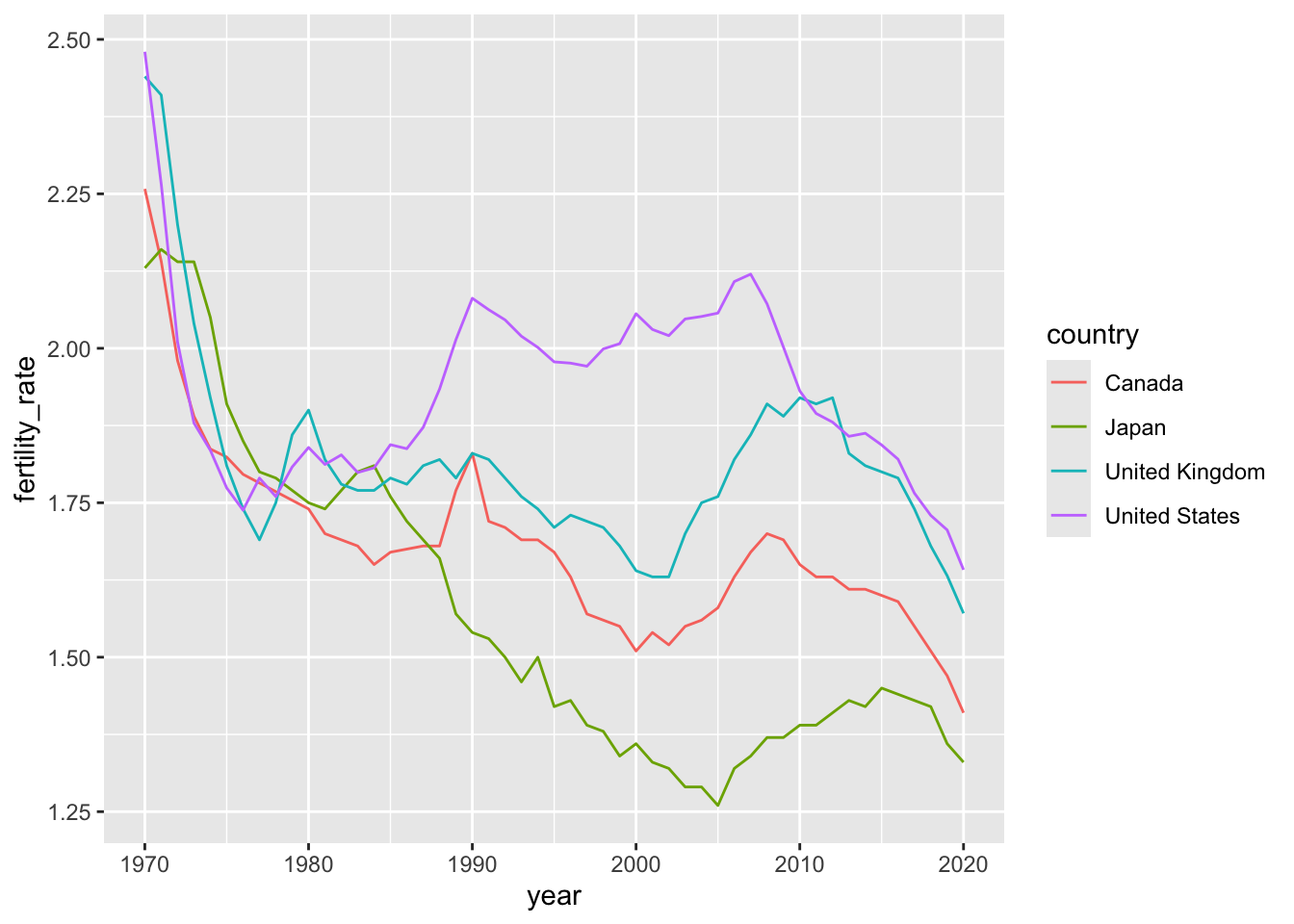
These time series are not particularly noisy, but they do exhibit short-term blips or fluctuations in fertility patterns that may, pursuant to our theoretical assumptions, represent “noise” around a simpler—and more informative—narrative.
One can easily imagine noisier data fraught with fluctuations (e.g., temperature, mortality at the height of a pandemic etc.) where inference is forestalled by the volatility of a variable of interest. Thankfully, we have tools—both parametric and non-parametric—that can smooth over these short-term volatilities to offer compelling visual evidence of how \(x\) and \(y\) are related.
The plot below uses geom_smooth() to simplify the same trends we encountered above. The function is powered by stat_smooth() under the hood, which (by default) uses local polynomial regressions or general additive models8 to generate smoothed estimates of \(y\) (in this case, fertility_rate) conditional on \(x\) (year).
ggplot(data = select_countries,
       mapping = aes(x = year, y = fertility_rate,
                     colour = country)) +
geom_smooth(mapping = # Adjusts hue of the confidence intervals:
                     aes(fill = country),
            alpha = 0.5)
We can adjust how we’re “smoothing” our data by changing the method argument within geom_smooth(). Here’s how to generate estimates from a linear model (in lieu of the default non-parametric approaches).
ggplot(data = select_countries,
      aes(x = year,
          y = fertility_rate,
          colour = country)) +
geom_smooth(aes(fill = country),
            method = "lm",
            alpha = 0.5)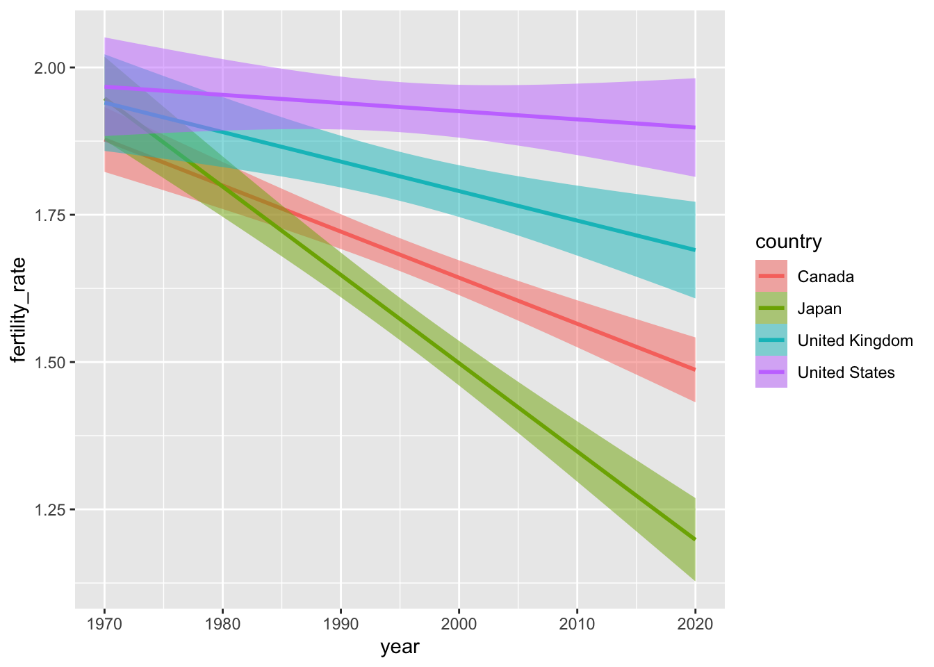
Density of Observations
Let’s go back to where we started. Remember our first quick example? We visualised the distribution of a variable (bill_depth_mm) by placing counts of observations into discrete boxes (or “bins”) via a histogram. In other words, what we visualised was not a 1:1 representation of our data, but a basic statistical transformation: i.e., the discretisation (or “binning”) of a numeric indicator (bill_depth_mm).
In ggplot2, several geoms—e.g., geom_histogram(), geom_freqpoly(), inter alia—are powered by stat_bin() under the hood. Yet, just as basic line plots can be sensitive to fluctuations, geom_histogram() and its analogues can, on occasion, be difficult to parse or produce summaries that are easy to misinterpret.
Consider the example below. We use after_stat() to perform a statistical transformation—i.e., a density estimate via stat_density()—after our life expectancy data has been discretised by stat_bin(). To wit, the plot below provides a standardised snapshot of the distribution of life expectancy across continents in 2007. The plot to the right provides an unstandardised look at the same distribution.
Questions (Click to Expand and/or Close)
What are the differences between these two plots? Click on either graphic to launch a gallery and begin your “investigation.” Why is the second plot misleading? What happens if we retain the observations from Oceania?
ggplot(data = gapminder |>
              # Zeroing in on latest year and removing Oceania
              # which has only two observations:
              filter(year == max(year),
                     !continent == "Oceania"),
       mapping = aes(x = lifeExp,
                     # Ensuring the "fill" (colour inside the distribution)
                     # and "colour" (the line) have the same attributes:
                     colour = continent)) +
geom_freqpoly(mapping = aes(y = after_stat(density)),
              binwidth = 5)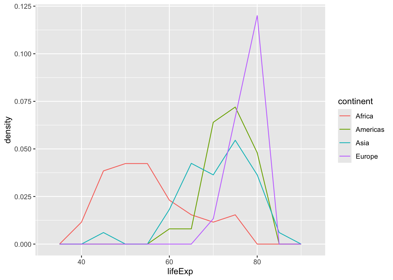
Here’s the same plot but without after_stat() applied.
gapminder |>
filter(year == max(year),
       !continent == "Oceania") |>
ggplot(aes(x = lifeExp,
       colour = continent)) +
geom_freqpoly(binwidth = 5)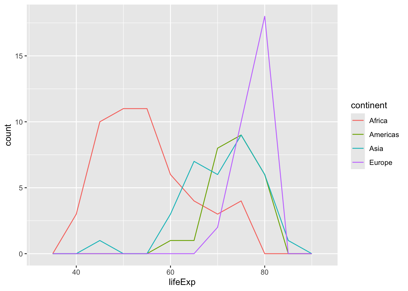
Of course, we could also remove the middleman and directly use geom_density() to produce smoothed distributional estimates of life expectancy across continents:
ggplot(data = gapminder |>
              # Zeroing in on latest year and removing Oceania
              # which has only two observations:
              filter(year == max(year),
                     !continent == "Oceania"),
       mapping = aes(x = lifeExp,
                     # Ensuring the "fill" (colour inside the distribution)
                     # and "colour" (the line) have the same attributes:
                     colour = continent,
                     fill = continent)) +
geom_density(alpha = 0.5)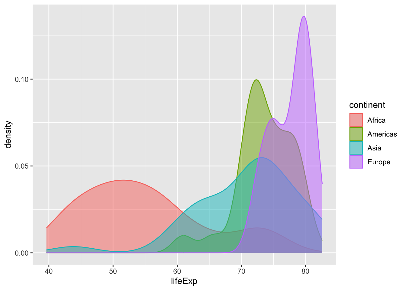
Step 2: Scales, Coordinates, Facets
Scales
When we map our data to layers, we do not have to accept the defaults (colour palettes, axis limits etc.) that we’ve seen thus far. Manipulating scales can help us moderate or tune how our variables are translated into visual aesthetics. By manipulating scales, we can zoom-in on specific quantities of interest, generate more focused or theoretically-relevant statistical summaries (via stat_* functions), and redefine the contours of the statistical graphics we produce.
Below, we’ll use scale_x_continuous() to reimagine our smoothed look at fertility rates over time in four countries. Specifically, we will (i) adjust the range of our \(x\)-axis; and (ii) the intervals (or breaks) between \(x\)-axis ticks and labels.
ggplot(data = select_countries,
       mapping = aes(x = year,
                     y = fertility_rate,
                     colour = country)) +
geom_smooth(mapping = # Adjusts hue of the confidence intervals:
                     aes(fill = country),
            alpha = 0.5)  +
scale_x_continuous(# Prunes the x-axis by setting new limits:
                   # 2000-2020 instead of 1970-2020
                   limits = c(2000, 2020),
                   # How is this range sliced up?
                   # Here, 2000 to 2020 in increments of 5 (years):
breaks = seq(2000, 2020, by = 5)) 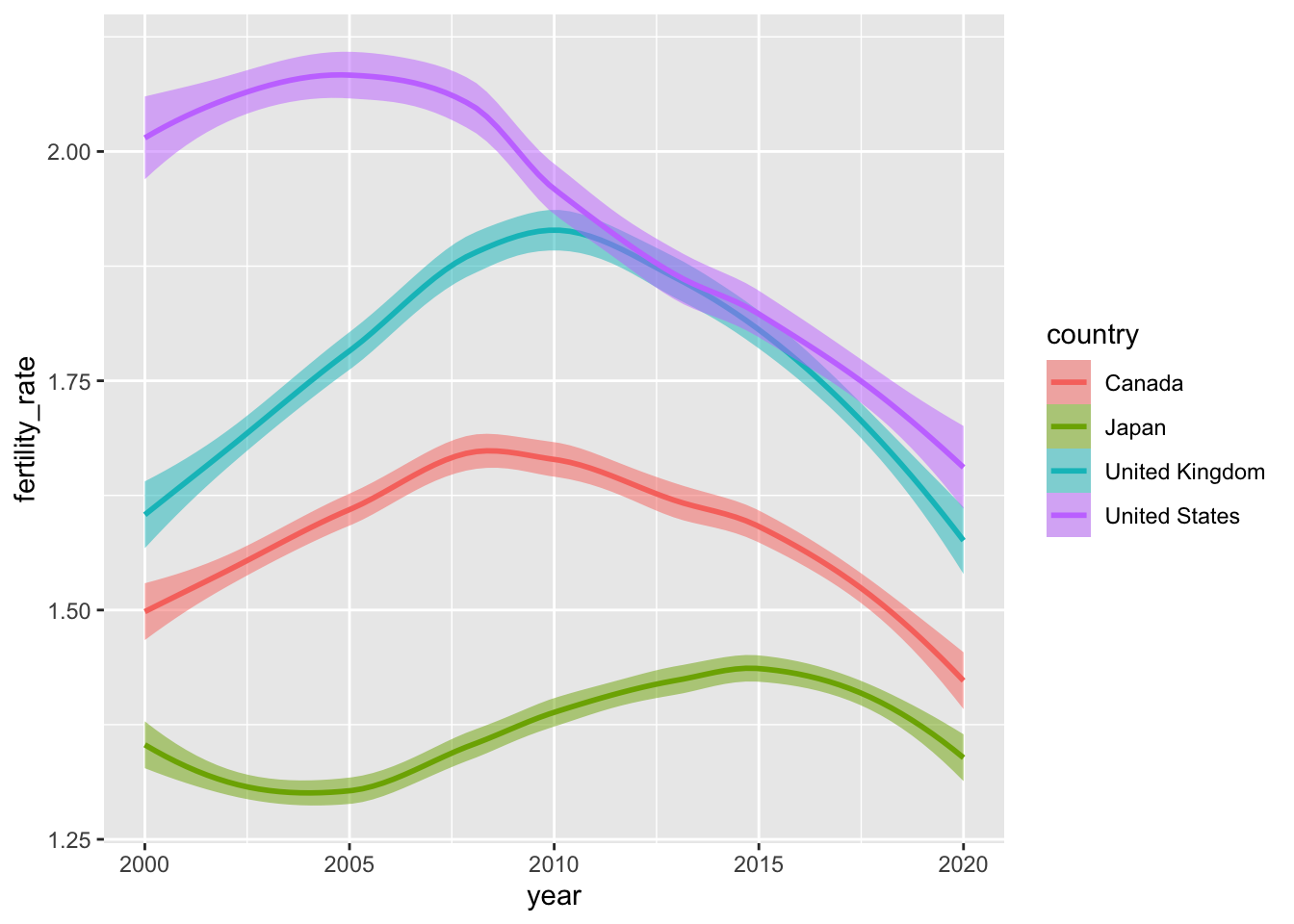
Questions (Click to Expand and/or Close)
Not to sound like a broken record, but what are the differences between these two plots? Click to compare and contrast. Are these differences meaningful?
The older version:
Scales can also be used to modify the layers we project onto our plot. In the example below, we introduce a pair of new geometric objects via geom_hline() and geom_vline that do not directly come from the input data, but match the scale of the \(y\)-axis (i.e., by being broadly “continuous” or arrayed along an interval scale).
Manipulating mapping aesthetics within the geom_hline() or geom_vline functions allows us to activate a second legend. In a follow-up step, we can tune arguments within scale_linetype_manual() to change how our linetypes looks—here, we produce dashed and dotted lines instead of solid lines (the default).
ggplot(data = select_countries,
       mapping = aes(x = year,
                     y = fertility_rate,
                     colour = country)) +
geom_smooth(mapping = aes(fill = country),
            alpha = 0.5)  +
scale_x_continuous(limits = c(2000, 2020),
                   breaks = seq(2000, 2020, by = 5)) +
geom_hline(mapping = aes(yintercept = 2.1,
                         linetype = "Replacement Level Fertility"),
           # Modifying colour of line:
           colour = "grey") +
# Adding vertical line as well
geom_vline(mapping = aes(xintercept = 2007.5,
                         linetype = "Global Recession"),
           colour = "black") +
scale_linetype_manual(name = "",
                      # Linking lines to distinct linetypes
                      values = c("Replacement Level Fertility" = "dashed",
                                 "Global Recession" = "dotted"))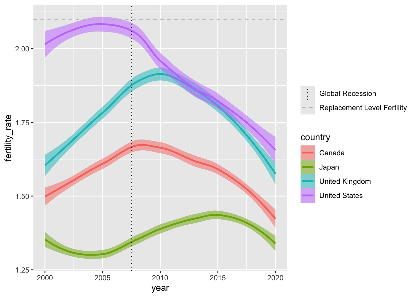
Crucially, we can use scale_fill_* and scale_colour_* functions to adjust the colour schemes associated with our visual layers. Below, we use palettes from ColorBrewer to change the look of our smoothed lines and confidence intervals.
ggplot(data = select_countries,
       mapping = aes(x = year,
                     y = fertility_rate,
                     colour = country)) +
geom_smooth(mapping = aes(fill = country),
            alpha = 0.5)  +
scale_x_continuous(limits = c(2000, 2020),
                   breaks = seq(2000, 2020, by = 5)) +
geom_hline(mapping = aes(yintercept = 2.1,
                         linetype = "Replacement Level Fertility"),
           colour = "grey") +
geom_vline(mapping = aes(xintercept = 2007.5,
                         linetype = "Global Recession"),
           colour = "black") +
scale_linetype_manual(name = "",
                      values = c("Replacement Level Fertility" = "dashed",
                                 "Global Recession" = "dotted")) +
# Using the "Dark 2" palette from the inbuilt
# colour_brewer() family of functions:
scale_colour_brewer(palette = "Dark2") +
scale_fill_brewer(palette = "Dark2")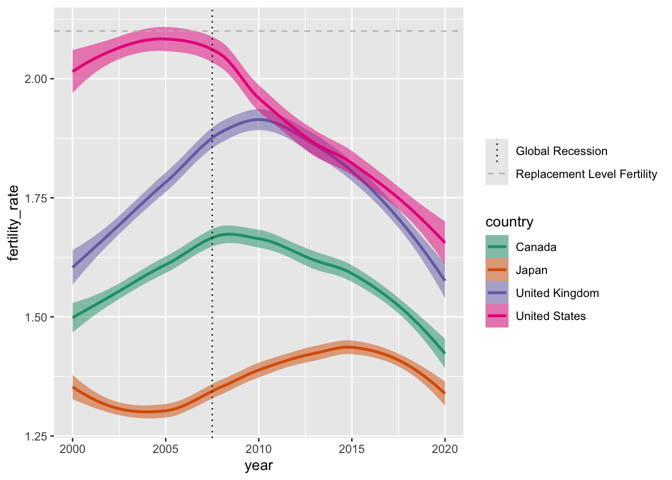
For our next example, we’re going to work with the mobility_covdata data frame. The data contains Apple Mobility Trends data for Montréal and London between February 1, 2020 and February 1, 2021—a period that includes the first major lockdowns related to COVID-19 as well as the emergence of the Alpha variant. For a broad summary of the data, click the button below.
Show Summary Data
| Name | mobility_covdata |
| Number of rows | 2202 |
| Number of columns | 4 |
| _______________________ | |
| Column type frequency: | |
| character | 2 |
| Date | 1 |
| numeric | 1 |
| ________________________ | |
| Group variables | None |
Variable type: character
| skim_variable | n_missing | complete_rate | min | max | empty | n_unique | whitespace |
|---|---|---|---|---|---|---|---|
| city | 0 | 1 | 6 | 8 | 0 | 2 | 0 |
| transportation_type | 0 | 1 | 7 | 7 | 0 | 3 | 0 |
Variable type: Date
| skim_variable | n_missing | complete_rate | min | max | median | n_unique |
|---|---|---|---|---|---|---|
| date | 0 | 1 | 2020-02-01 | 2021-02-01 | 2020-08-02 | 367 |
Variable type: numeric
| skim_variable | n_missing | complete_rate | mean | sd | p0 | p25 | p50 | p75 | p100 | hist |
|---|---|---|---|---|---|---|---|---|---|---|
| score | 12 | 0.99 | 71.86 | 33.18 | 11.21 | 43.41 | 69.27 | 98.83 | 170.69 | ▆▇▆▃▁ |
Below, we’ll produce smoothed mobility trends for London, England—with different lines corresponding to different modes of transportation.
# Data can be piped in as a part of a longer code sequence:
mobility_covdata |>
# Isolating data from London:
filter(str_detect(city, "Lon")) |>
ggplot(aes(x = date,
           y = score,
           colour = transportation_type,
           fill = transportation_type)) +
geom_smooth()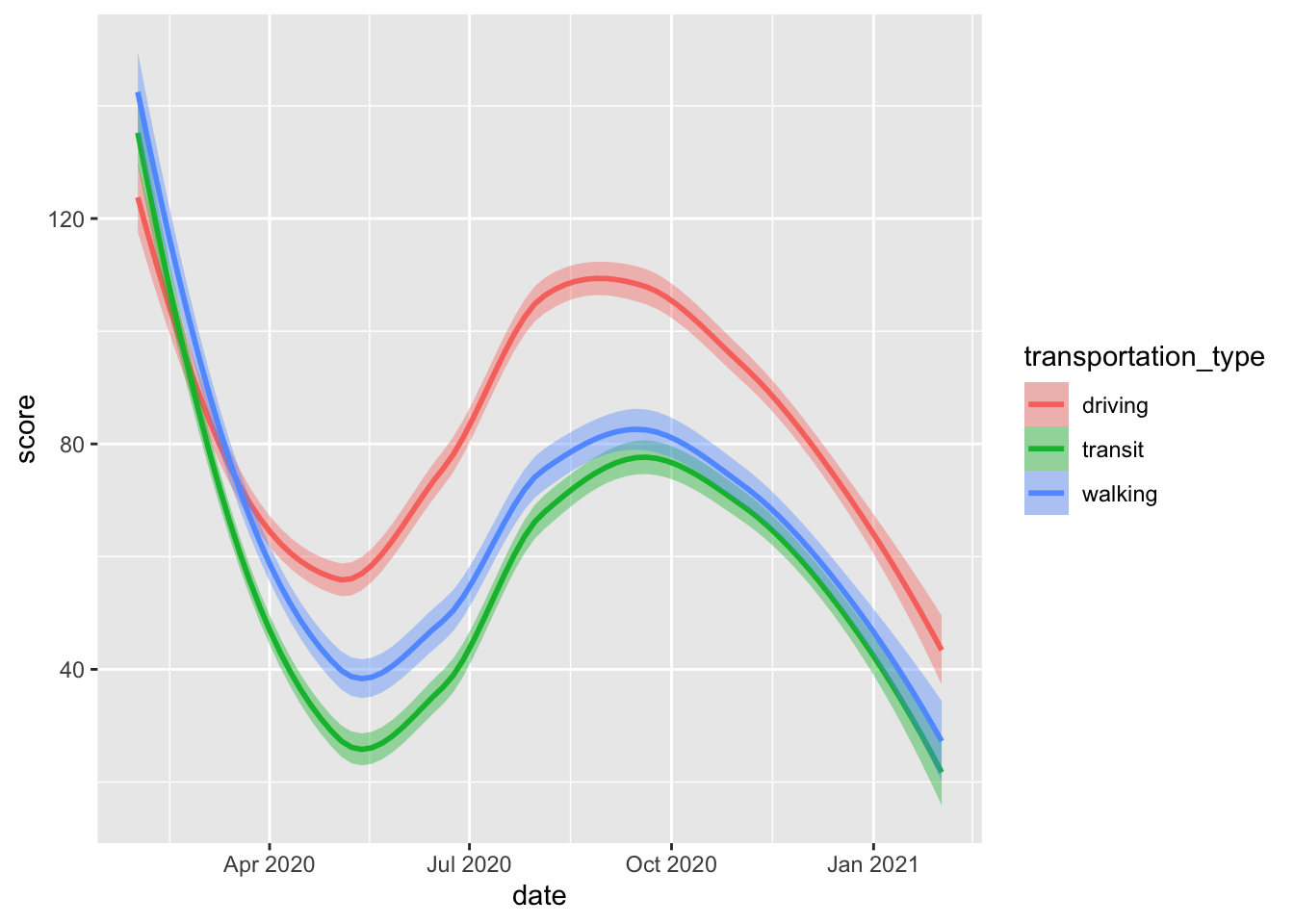
As we tune our plot, we can adjust our colour schemes and the way dates are partitioned and displayed along the \(x\)-axis using the scale_x_date() function.
mobility_covdata |>
filter(str_detect(city, "Lon")) |>
ggplot(aes(x = date,
           y = score,
           colour = transportation_type,
           fill = transportation_type)) +
geom_smooth() +
# Using the inbuilt viridis functions to adjust colour/fill aesthetics:
scale_colour_viridis_d(option = "inferno") +
scale_fill_viridis_d(option = "inferno") +
# Modifying how dates are displayed on the plot:
scale_x_date(# Breaks between dates:
             date_breaks = "2 months",
             # Date format --- run ?strptime for more information:
             date_labels = "%D")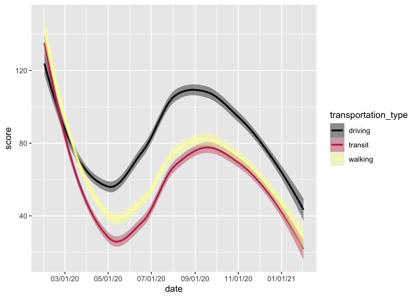
Coords
Thus far, we’ve been operating in Cartesian space—or implicitly using the cood_cartesian() coordinate system to visualise our data. While this makes sense most of the time, we may need to adjust our coordinate system to produce specific types of visualisations or to make the most out of specific geoms. For instance, geom_polygon() may not be particularly informative or useful in Cartesian space.
ggplot(data = penguins_modified,
       mapping = aes(x = variable,
                     y = value,
                     group = species,
                     fill = species,
                     colour = species))  +
geom_polygon(alpha = 0.4)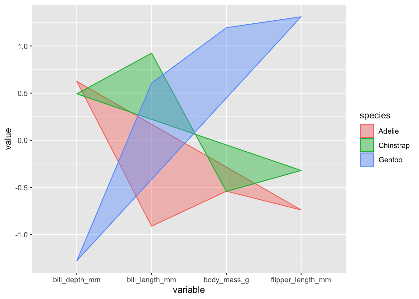
Using a polar coordinate system [via see::coord_radar()] can change the look and meaning of our visualisation.
ggplot(data = penguins_modified,
       mapping = aes(x = variable,
                     y = value,
                     group = species,
                     fill = species,
                     colour = species))  +
geom_polygon(alpha = 0.4) +
see::coord_radar()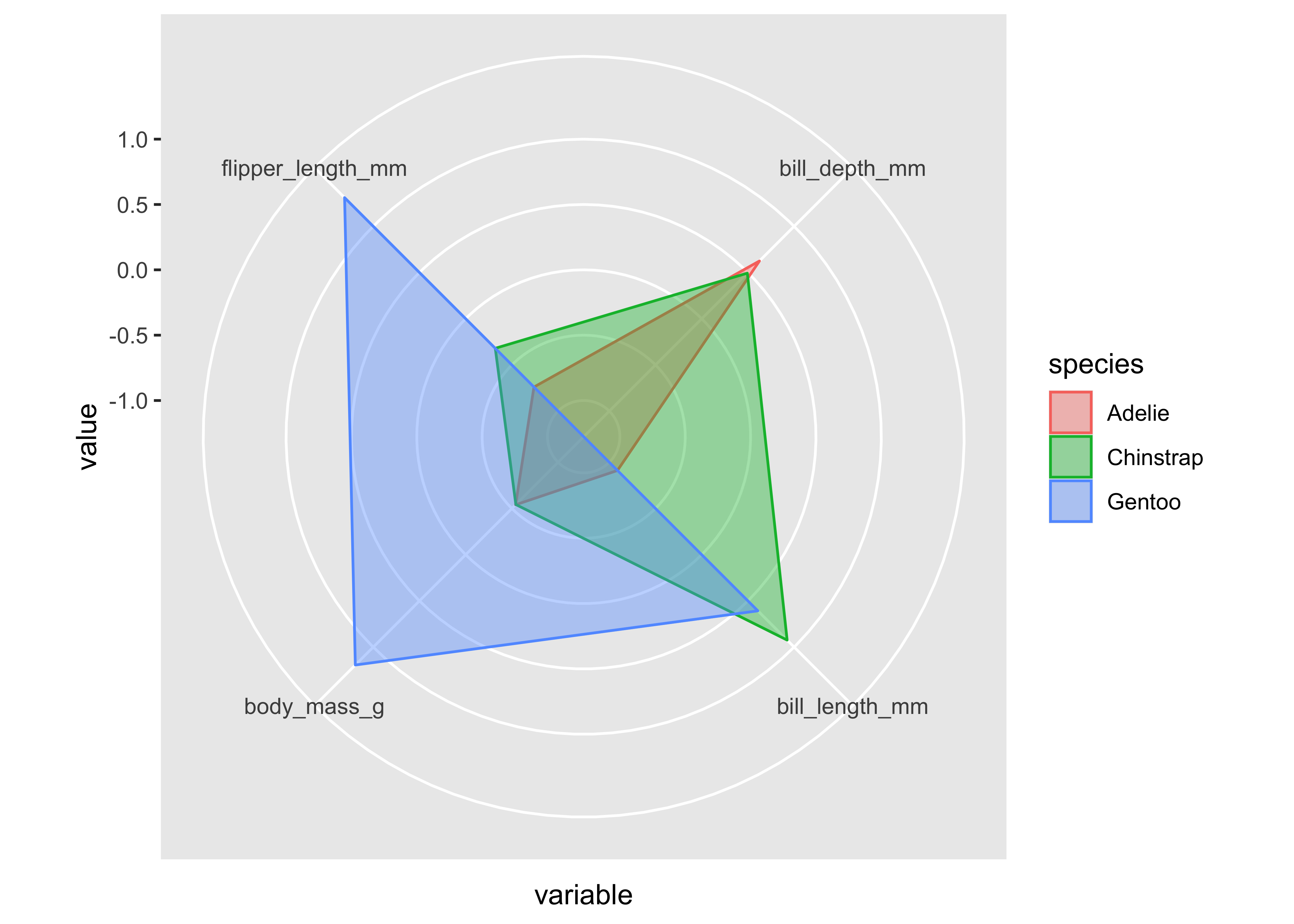
For inspiration, check out this gallery featuring more refined radar charts.
Pie Charts (Click to Expand and/or Close)
Pie charts are popular, but should generally be avoided.
That said, you may have to make one at some point. With that in mind, here’s a very simple example—but beware: this snippet includes code we have yet to cover.
Show Code
select_countries_sex |>
filter(year == 1980, country == "United Kingdom") |>
mutate(label = paste0(round(pop_share), "%")) |>
ggplot(mapping = aes(x = "", y = pop_share, fill = sex)) +
geom_bar(stat = "identity") +
coord_polar(theta = "y") +
theme_void() +
geom_text(mapping = aes(label = label),
          colour = "white",
          position = position_stack(vjust = 0.5)) +
labs(title = "Sex Distribution in the United Kingdom (1980)") +
scale_fill_brewer(palette = "Set1")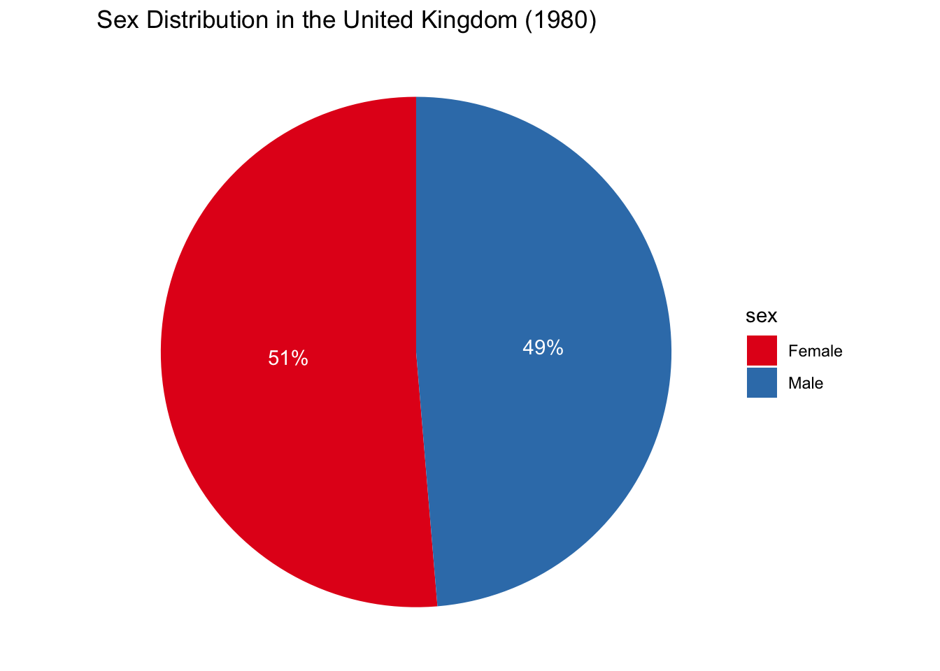
Facets
In previous examples, we’ve been filtering or subsetting our data to produce simple visualisations. This is generally not necessary and can sometimes muddy the story we’re trying to tell. Facets are a way to visualise small multiples of our data in lieu of discarding information. This is especially useful for comparing differences across theoretically-meaningful subsamples.
In the example below, we compare mobility trends in London and Montréal using facet_wrap().
mobility_covdata |>
ggplot(aes(x = date,
           y = score,
           colour = transportation_type,
           fill = transportation_type)) +
geom_smooth() +
scale_colour_viridis_d(option = "inferno") +
scale_fill_viridis_d(option = "inferno") +
scale_x_date(date_breaks = "2 months",
             date_labels = "%D") +
# Creating small multiples of the data:
# Here, we're conditioning on city/generating two rows of
# facets (or panels):
facet_wrap(~city, nrow = 2)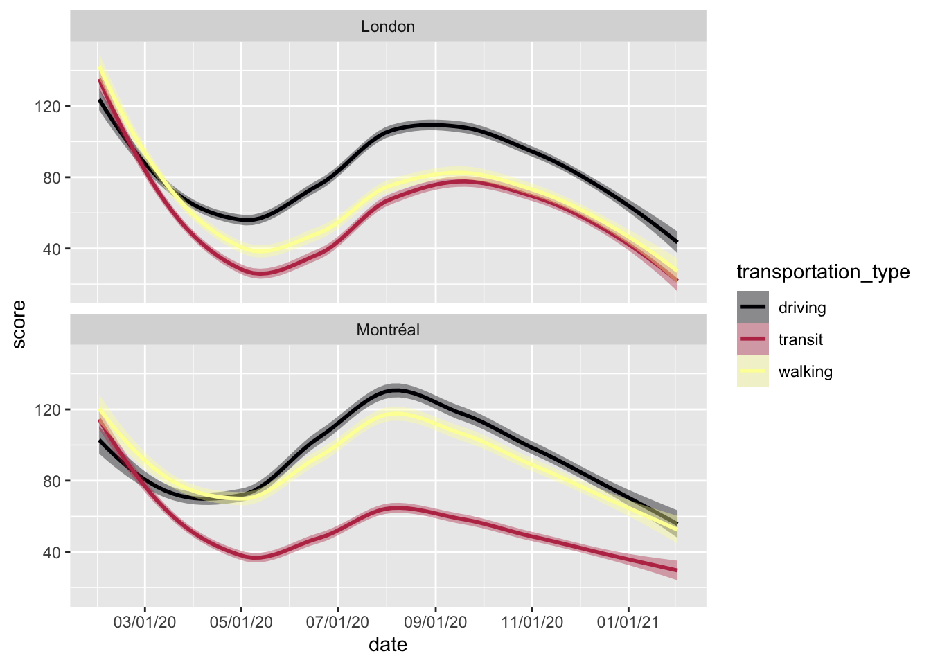
Below, we compare the evolution of sex disparities in life expectancy in four countries. Make note of how we use scale_fill_grey() to produce a greyscale colour scheme.
penguins |>  # Dropping missing values (for simplicity):
drop_na() |>
ggplot(mapping = aes(x = bill_length_mm,
                     y = flipper_length_mm,
                     colour = sex,
                     fill = sex))  +
geom_point(size = 3,
           colour = "white",
           # For more information, see ?pch:
           shape = 21) +
coord_radial(# Should the y-axis axis labels be inside the plot?
             r.axis.inside = TRUE,
             # Size of the "donut" inside:
             inner.radius = 0.25) +
# One row of small multiples:
facet_wrap(~species, nrow = 1) +
# Greyscale fill themes:
scale_fill_grey() 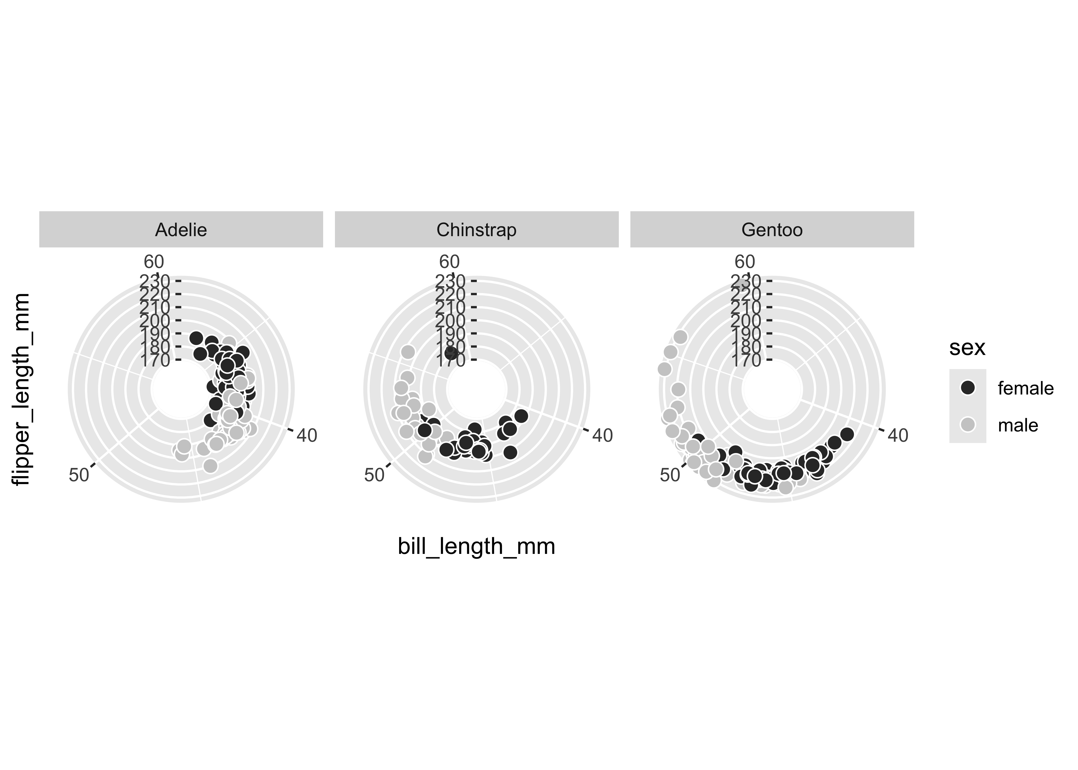
In facet_wrap(), each panel or facet represents a specific subsample—or in more technical terms, the function “wraps a 1d ribbon of panels into 2d” (Wickham, Navarro, and Pedersen 2023). Conversely, facet_grid() explicitly lays out plots in a two-dimensional grid corresponding to rows and columns of variables.
select_countries |>
# Reorienting data (to long/"tidy" format):
pivot_longer(!c(country, year),
             names_to = "indicator",
             values_to = "value") |>
ggplot(aes(x = year,
           y = value,
           colour = country, fill = country)) +
geom_smooth(alpha = 0.5) +
scale_x_continuous(breaks = seq(1970, 2020, by = 25)) +
# Creating a grid of small plots (row ~ column):
facet_grid(indicator ~ country,
           # Ensures that both panels can have their own
           # x/y limits:
           scales = "free") +
scale_colour_brewer(palette = "Dark2") +
scale_fill_brewer(palette = "Dark2")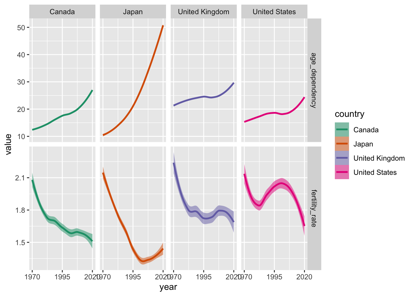
Step 3: Labels, Themes and Guides
Adjusting Labels
As we finalize our plots, we will want to adjust the titles of our axes and legends. We can do this easily using the labs() function.
ggplot(gapminder |>
       filter(year == max(year) |
              year == min(year)),
       aes(x = log(gdpPercap), y = lifeExp))  +
facet_wrap(~year, nrow = 2) +
geom_point(aes(colour = continent, size = pop), alpha = 0.65)  +
geom_smooth(colour = "black", alpha = 0.35,
            method = "lm",
            linewidth = 0.5) +
labs(# Editing x-axis title:
     x = "Log of Per Capita GDP",
     # Editing y-axis title:
     y = "Life Expectancy in Years",
     # Removing legend title for the colour aesthetic:
     colour = "",
     # Changing legend title for the size aesthetic:
     size = "Population") +
# Using functions within scales function to clean up labels ---
# in this case, simply adding a "+" sign
scale_size_continuous(labels = scales::label_comma(suffix = " +")) 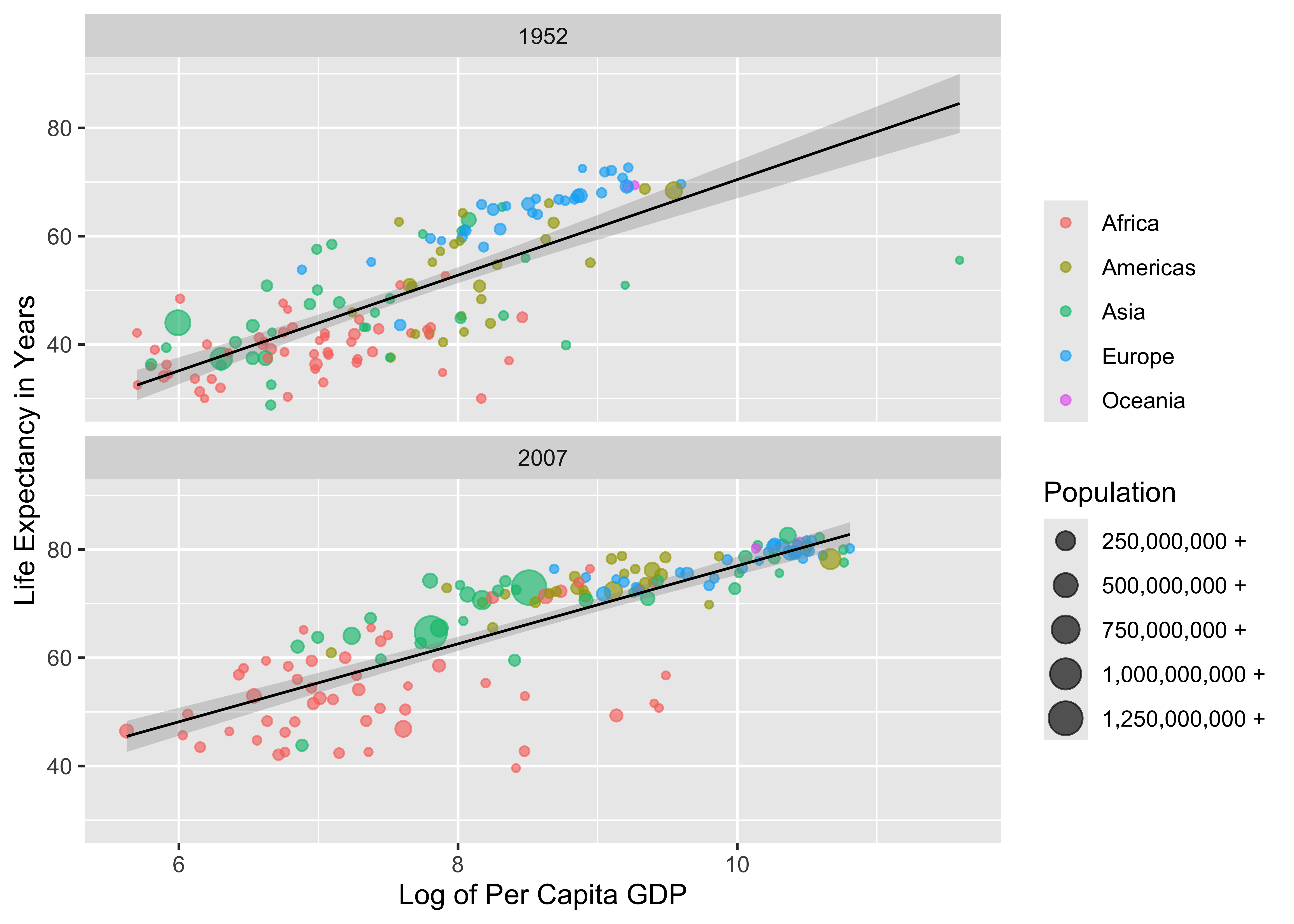
Adjusting Themes
We are not beholden to the default theme—theme_grey()—for displaying all non-data elements in our plot. In the example below, we will:
- Use
theme_bw(). - Change our base font family to
IBM Plex Sans. - Toggle arguments within the
theme()function so that we can—- Produce a title in boldface.
- Modify the colour of our subtitle.
- Modify the space between our axis titles and text.
- Remove minor grid lines.
- Move our legends to the bottom of the plot.
- Adjust the size of the symbols or keys in our legends.
- Ensure that our legends are displayed in two rows as opposed to one.
Sounds like a lot, right? Don’t worry: we will walk through (and ideally, demystify) the process during the workshop.
# Zeroing in on the first and last year in the gapminder df:
gapminder |>
filter(year == max(year) |
               year == min(year)) |>
ggplot(aes(x = log(gdpPercap), y = lifeExp))   +
facet_wrap(~year) +
geom_point(aes(colour = continent, size = pop), alpha = 0.65)  +
geom_smooth(colour = "black", alpha = 0.35,
            method = "lm",
            linewidth = 0.5) +
labs(title = "Relationship Between GDP and Life Expectancy",
     subtitle = "Over 50 Years Apart",
     x = "Log of Per Capita GDP",
     y = "Life Expectancy in Years",
     colour = "",
     size = "Population") +
scale_colour_brewer(palette = "Dark2") +
scale_size_continuous(labels =
                      function(x) paste(x/1000000, "mil")) +
# Using theme_bw() to modify default "look" of the plot; using the
# IBM Plex Sans plot:
theme_bw(base_family = "IBM Plex Sans") +
theme(# Ensuring that the plot title is in boldface:
      plot.title = element_text(face = "bold"),
      # Changing the colour of the subtitle:
      plot.subtitle = element_text(colour = "grey45"),
      # Adding space to the right of the y-axis title
      # (pushing text away from the plot panel):
      axis.title.y = element_text(margin = margin(r = 15)),
      # Adding space to the top of the x-axis title:
      axis.title.x = element_text(margin = margin(t = 15)),
      # Removing minor gridlines not linked to axis labels:
      panel.grid.minor = element_blank(),
      # Placing legend on the bottom of the plot:
      legend.position = "bottom",
      # Increasing the size of the legend keys:
      legend.key.size = unit(1, "cm"),
      # Arranging multiple legends vertically (more than one row):
      legend.box = "vertical")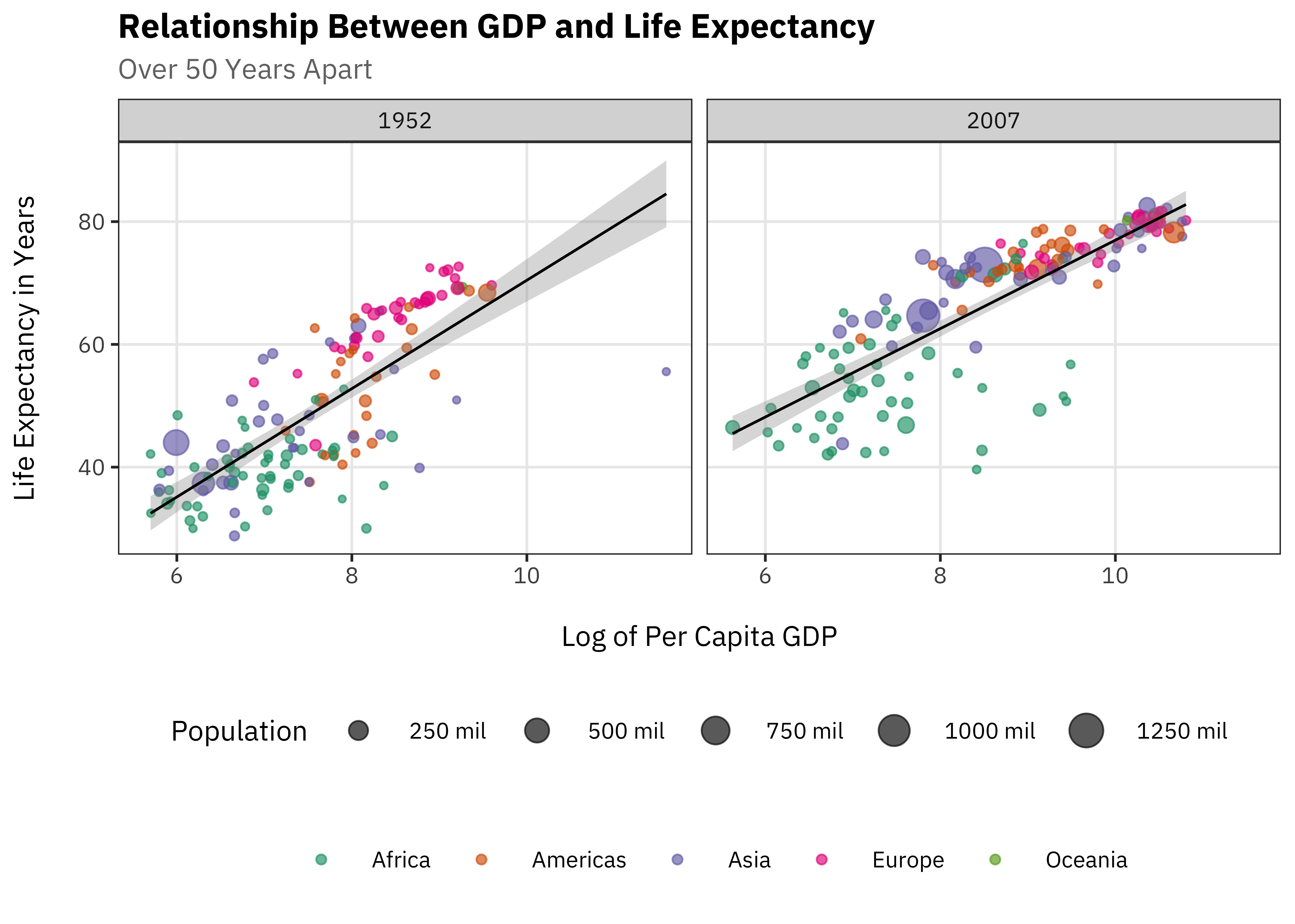
Adjusting Legend Guides
Using guides() can give us fine-grained control over plot legends generated by guide_legend(), guide_bins(), guide_colourbar and so on. Below, we will manipulate our guides() to rearrange the order of our legends, adjust the position of our legend titles, and more.
ggplot(gapminder |>
       filter(year == max(year) |
              year == min(year)),
       aes(x = log(gdpPercap), y = lifeExp))   +
facet_wrap(~year) +
geom_point(aes(colour = continent,
               # Sizing plots based on log of population:
               size = log(pop)),
               alpha = 0.65)  +
geom_smooth(colour = "black",
            alpha = 0.35,
            method = "lm",
            linewidth = 0.5) +
labs(title = "Relationship Between GDP and Life Expectancy",
     subtitle = "Over 50 Years Apart",
     x = "Log of Per Capita GDP",
     y = "Life Expectancy in Years", colour = "",
     size = "Log of Population") +
scale_size_binned(# Range of plot sizes:
                  range = c(0.1, 3.5),
                  labels = function(x) paste(x, "+")) +
scale_colour_brewer(palette = "Dark2") +
theme_bw(base_family = "IBM Plex Sans") +
theme(plot.title = element_text(face = "bold"),
      plot.subtitle = element_text(colour = "grey45"),
      axis.title.y = element_text(margin = margin(r = 15)),
      axis.title.x = element_text(margin = margin(t = 15)),
      panel.grid.minor = element_blank(),
      legend.position = "bottom",
      legend.key.size = unit(1, "cm"),
      legend.box = "vertical") +
guides(size = guide_bins(# Push legend title to the bottom:
                           title.position = "bottom",
                           # Centring legend title.
                           title.hjust = 0.5)) +
guides(# Rearranging order of legends; colour now appears first.
       colour = guide_legend(order = 1,
                            # Overriding aes - all keys are
                             # at size = 5.
override.aes = list(size = 5))) 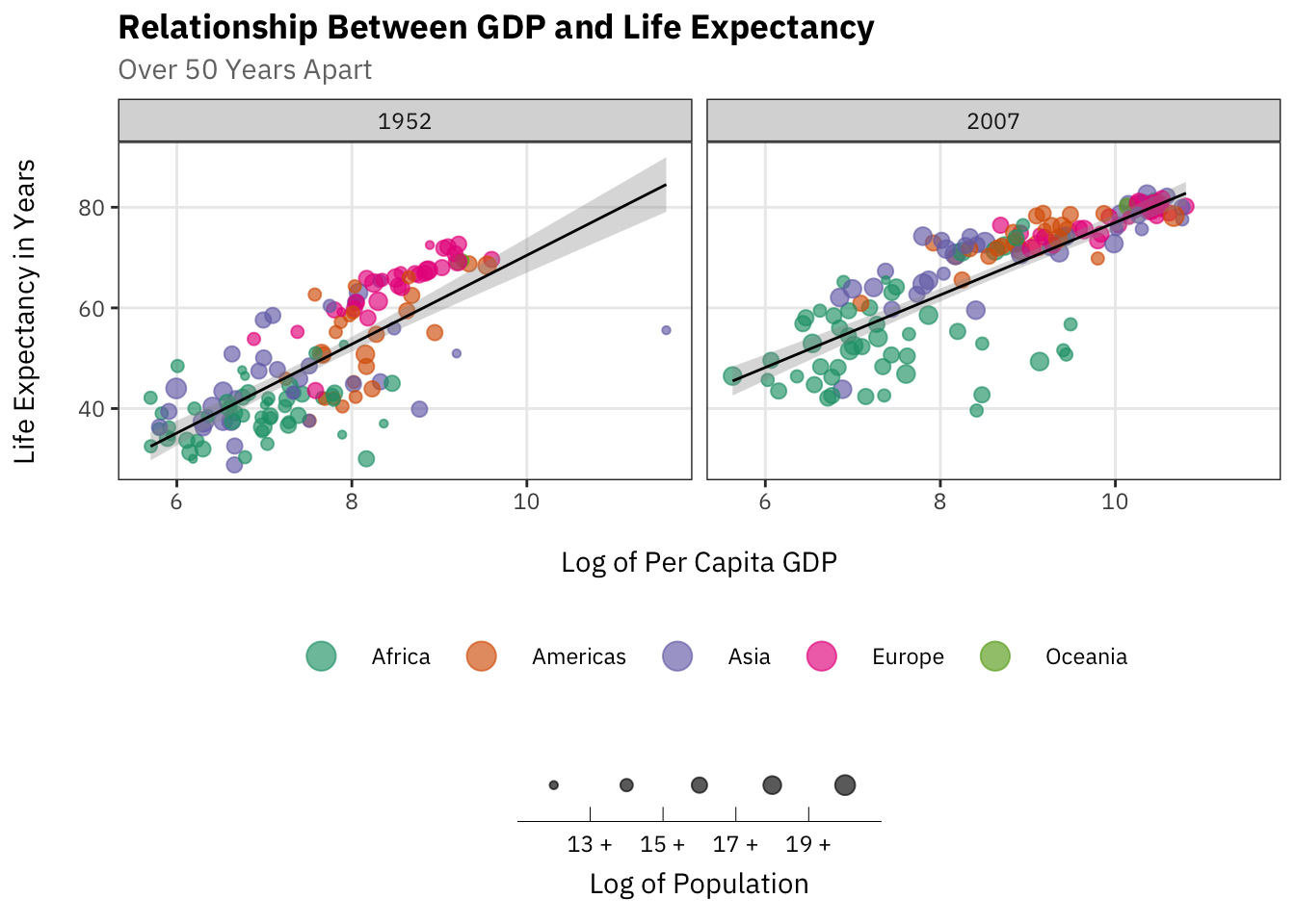
Plot Modifications, Customisation etc.
Extensions: Additional Geoms
There are a myriad of ggplot2 extensions out there (and thus, a myriad of additional geoms to exploit). Below is a quick look at a few useful extensions—inclusive of geom_density_ridges() and geom_label_repel(). We will go through these geoms in some detail during the workshop.
Density Ridges
Show Code
library(ggridges)

ggplot(gapminder |>
       filter(year == max(year),
              !continent == "Oceania"),
       aes(x = lifeExp,
           y = fct_rev(continent),
           fill = continent,
           colour = continent)) +
geom_density_ridges(alpha = 0.35,
                    jittered_points = TRUE)  +
scale_colour_brewer(palette = "Dark2") +
scale_fill_brewer(palette = "Dark2") +
theme_ridges() +
labs(x = "Life Expectancy in 2007", y = "") +
theme(text = element_text(family = "IBM Plex Sans"),
      legend.position = "none") +
# Removes all padding around y-axis:
scale_y_discrete(expand = c(0, 0)) +
# Removes all padding around x-axis:
scale_x_continuous(expand = c(0, 0)) 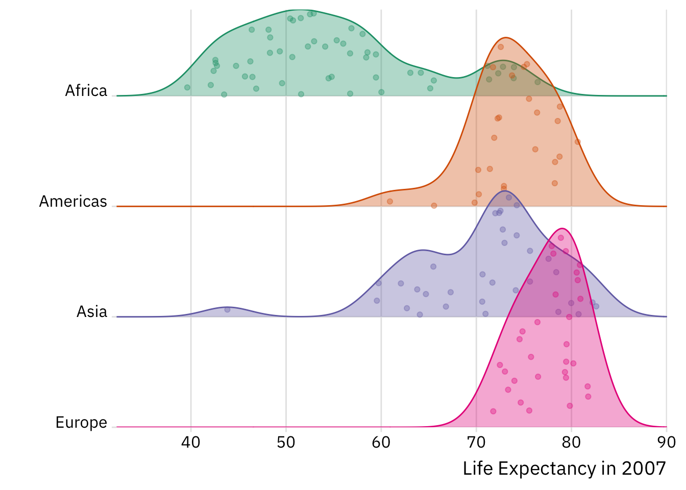
Repel Labels
Show Code
library(lemon)
library(ggrepel)

select_countries |>
# Zooming on 1970 and 2020
filter(year %in% c(1970, 2020)) |>
# Creating a label variable:
mutate(label = paste(as.character(round(age_dependency, 1)),
                     "per 100")) |>
ggplot(aes(x = as_factor(year),
           y = age_dependency,
           group = country,
           label = label,
           colour = country,
           fill = country)) +
facet_rep_wrap(~country,
               nrow = 4,
               # Repeats axis text for each facet:
               repeat.tick.labels = TRUE) +
geom_point(size = 3) +
geom_line() +
# Adding labels to the points:
geom_label_repel(segment.color = "grey85",
                 colour = "white",
                 # Moving label down:
                 nudge_y = -10,
                 show.legend = FALSE,
                 size = 4.5,
                 family = "IBM Plex Sans") +
scale_colour_brewer(palette = "Dark2") +
scale_fill_brewer(palette = "Dark2") +
labs(title = "Rising Old Age Dependency",
     subtitle = "In the Last Half Century",
     x = "",
     y = "Old Age Dependency Ratio",
     caption = "Old Age Dependency =\nRatio of Elderly Population (64+) to Working Age Population (15-64)") +
theme_classic(base_family = "IBM Plex Sans") +
theme(legend.position = "none",
      plot.title = element_text(face = "bold"),
      plot.subtitle = element_text(colour = "grey50"),
      axis.title.y = element_text(size = 12, margin = margin(r = 15)),
      strip.text = element_text(size = 12),
      plot.caption = element_text(hjust = 0),
      axis.text.x = element_text(size = 12),
      axis.text.y = element_text(size = 10))
Networks
Show Code
library(ggraph)

ggraph(toy_network,
       # Kamada-Kawai algorithm:
       layout = "kk") +
  # Adding layer of edges
geom_edge_diagonal(mapping = aes(edge_alpha = 0.8),
                   show.legend = FALSE,
                   colour = "lightgrey") +
# Adding nodes
geom_node_point(size = 6,
                shape = 21,
                colour = "white",
                fill = "darkred") +
# Adding labels
geom_node_label(aes(label = name),
                family = "IBM Plex Sans",
                nudge_y = -0.1,
                fill = "darkred",
                colour = "white",
                size = 4) +
# Removing grid lines, axis labels, tickets and so on:
theme_void() +
# Creating black background:
theme(panel.background = element_rect(fill = "black"))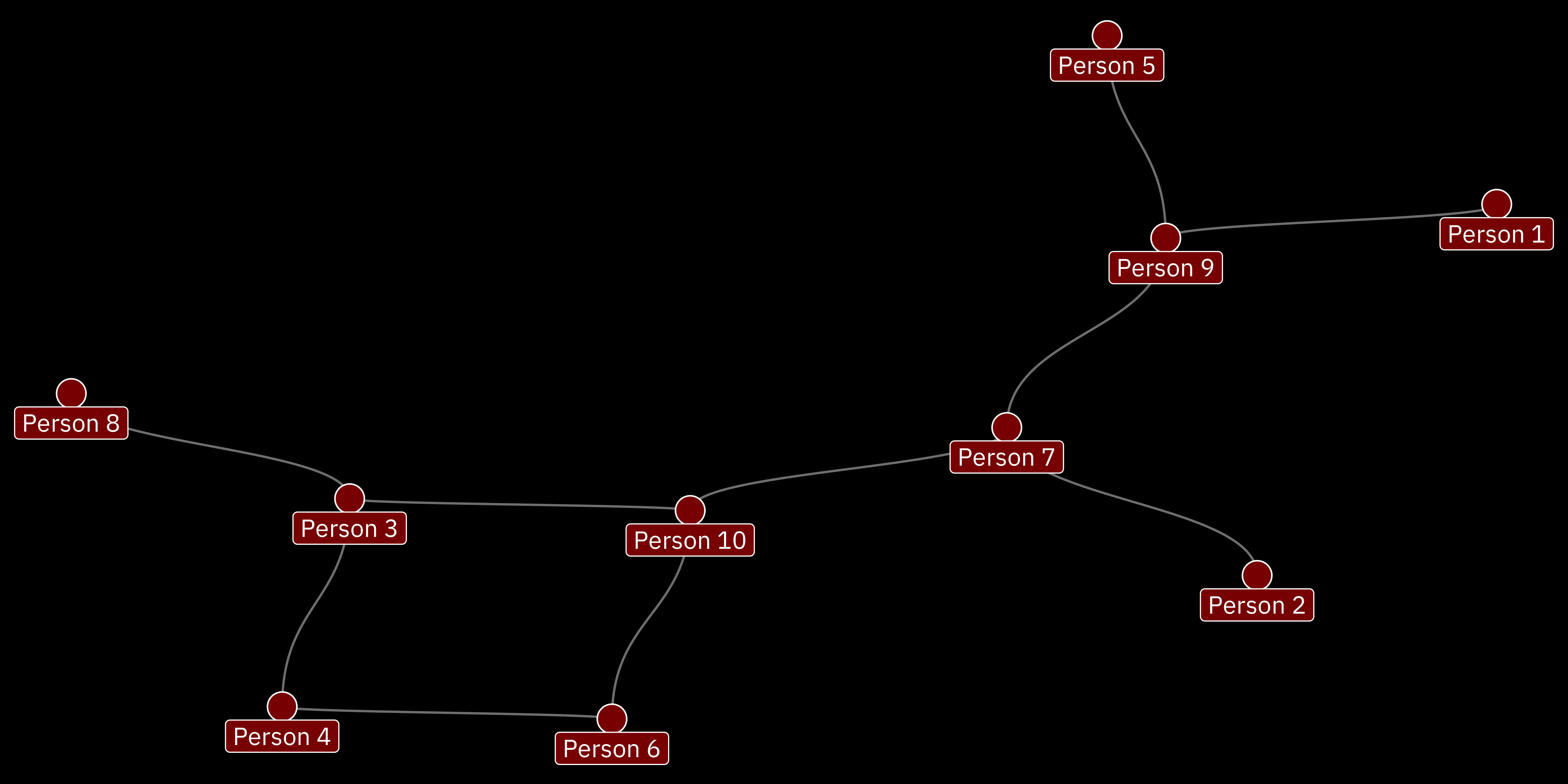
Extensions: More Schemes and Themes
Beyond new geoms, there are a range of ggplot2 themes and colour palettes we can use to produce unique statistical graphics.
In the example below, we draw on (i) scale_fill_colorblind and scale_colour_colorblind (from ggthemes) to make use of colours that should, in principle, be visible to those with colour blindness; and (ii) theme_classic() from the see package to redefine our plot’s theme.
Show Code
library(ggthemes)
library(see)

select_countries |>
pivot_longer(!c(country, year),
             names_to = "indicator",
             values_to = "value") |>
mutate(indicator = ifelse(str_detect(indicator, "age_"),
                          "Old Age Dependency",
                          "Fertility Rate")) |>
ggplot(aes(x = year, y = value,
              colour = country, fill = country)) +
geom_smooth(alpha = 0.5) +
scale_x_continuous(breaks = seq(1970, 2020, by = 25)) +
facet_grid(fct_rev(indicator) ~ country,
           scales = "free") +
labs(x = "", y = "") +
# Colour/fill themes that should be visible to individuals with
# colour blindness:
scale_colour_colorblind() +
scale_fill_colorblind() +
# Classic theme from the "see" package:
theme_classic(base_family = "Inconsolata") +
theme(strip.text.y = element_text(angle = 0),
      panel.spacing = unit(1, "cm"),
      panel.grid.minor = element_blank(),
      legend.position = "none",
      plot.title = element_text(face = "bold"),
      plot.subtitle = element_text(colour = "grey50"),
      axis.title.y = element_text(size = 12, margin = margin(r = 15)),
      strip.text = element_text(size = 12),
      plot.caption = element_text(hjust = 0),
      axis.text.x = element_text(size = 12),
      axis.text.y = element_text(size = 10))
Below, we use the rainbow colour palette from gglgbtq to implement a colour scheme based on the pride flag.
Show Code
library(gglgbtq)

ggplot(gapminder |>
      filter(year == max(year),
             !continent == "Oceania"),
       aes(x = lifeExp, y = fct_rev(continent),
           fill = continent,
           colour = continent)) +
geom_density_ridges(alpha = 0.35,
                    jittered_points = TRUE)  +
scale_colour_manual(values = palette_lgbtq("rainbow")) +
scale_fill_manual(values = palette_lgbtq("rainbow")) +
theme_ridges() +
labs(x = "Life Expectancy in 2007", y = "") +
theme(text = element_text(family = "IBM Plex Sans"),
      legend.position = "none") +
# Removes all padding around y-axis:
scale_y_discrete(expand = c(0, 0)) +
# Removes all padding around x-axis:
scale_x_continuous(expand = c(0, 0))
Search for Colour Palettes
This is, in many ways, just the tip of the iceberg. If you don’t believe me, you can browse the interactive table below. The table—which is powered by the paletteer package9—includes information about a dizzying array of packages and colour palettes that you can access in .
Saving a Plot
Thus far, we have elided a very important topic: how to save plots. In most cases, saving a plot produced by ggplot2 is an exercise in perseverance. We can use ggsave() to play around with the the dimensions (i.e., width and height) of our plot until we arrive at sensible specifications. Here’s an example based on our first implementation of geom_density_ridges():
Show Code
ggridges_plot <- ggplot(gapminder |>
                        filter(year == max(year),
                              !continent == "Oceania"),
                        aes(x = lifeExp, y = fct_rev(continent),
                            fill = continent,
                            colour = continent)) +
                 geom_density_ridges(alpha = 0.35,
                                     jittered_points = TRUE)  +
                 scale_colour_brewer(palette = "Dark2") +
                 scale_fill_brewer(palette = "Dark2") +
                 theme_ridges() +
                 labs(x = "Life Expectancy in 2007", y = "") +
                 theme(text = element_text(family = "IBM Plex Sans"),
                       legend.position = "none") +
                 # Removes all padding around y-axis:
                 scale_y_discrete(expand = c(0, 0)) +
                 # Removes all padding around x-axis:
                 scale_x_continuous(expand = c(0, 0)) +
                 # Allows plotting outside of the plot margin/panel:
                 coord_cartesian(clip = "off")

ggsave(ggridges_plot,
       filename = "ridges_plot.svg",
       # In inches;
       height = 8,
       width = 9,
       # What kind of file are we producing?
       device = grDevices::svg,
       dpi = 300)
There are some alternatives out there. For instance, the camcorder package provides efficient workarounds [to the traditional ggsave() approach] that some of you may want to explore moving forward.
Visualisations for Population Research
This section is designed to be less didactic. Having gone through the fundamentals of ggplot2, we are now going to produce a set of three (relatively) complex visualisations that are germane to population research: a heatmap of the vicissitudes of mortality in France; a Lexis diagram that helps us think through the interdependencies linking ages, periods and cohorts; and a population pyramid that summarises the sex distribution in Canada in 2021. During the workshop, we will slowly build each of the plots featured below — but you are free to click the Show Code button to quickly see how we’ll move from point \(a\) to \(b\).
Heatmaps
Below, we’ll reproduce Kieran Healy’s wonderful French mortality poster.
Show Code
library(demography)
library(hrbrthemes)
library(colorspace)

fr.mort |> as_tibble() |>
           filter(!Group == "total", !Age > 100) |>
           ggplot(aes(x = Year, y = Age, fill = ntile(Mortality, 100))) +
           facet_wrap(~paste0(str_to_title(Group),"s"), nrow = 2) +
           geom_raster() +
           # scale_fill_viridis_c(option = "magma", direction = -1) +
           scale_fill_continuous_sequential(palette = "SunsetDark") +
           scale_x_continuous(breaks = seq(1816, 2006, by = 20)) +
           theme_modern_rc(base_family = "IBM Plex Sans") +
           labs(title = "Mortality in France",
                subtitle = "1816-2006",
                x = "",
                fill = "Death Rate (Percentile)") +
            guides(fill = guide_legend(nrow = 1,
                                       title.position = "top",
                                       label.position = "bottom")) +
            theme(plot.title = element_text(size = 25),
                  plot.subtitle = element_text(size = 15),
                  axis.title.y = element_text(size = 13,
                                              margin = margin(r = 15)),
                  legend.text = element_text(size = 12),
                  strip.text = element_text(colour = "white"),
                  panel.grid.minor = element_blank(),
                  legend.key = element_rect(colour = "white", linewidth = 1.1),
                  legend.justification = "top")
The Poster (Click to Expand and/or Close)
For reference, here’s the poster in question:
Quick Exercise (Click to Expand and/or Close)
Use the aus.fert data frame to produce a heatmap of fertility rates in Australia in the 20th century. Can you use geom_tile() as an alternative to geom_raster()?
Lexis Diagrams
Lexis diagrams are very popular tools that demographers use to think through the functional interdependencies between age, period, and cohort dynamics. Here, we use the LexisPlotR package to generate a custom Lexis diagram and the annotate() function to provide additional information.
Show Code
library(ggtext)
library(LexisPlotR)

lexis_grid(year_start = 1990,
           year_end = 2020,
           age_start = 15, age_end = 64) |>
lexis_age(age = 25,
          fill = "lightseagreen") |>
lexis_year(year = 2015, fill = "pink") |>
lexis_cohort(cohort = 1995, fill = "black") +
# lexis_lifeline(birth = "1995-11-07",
#                lwd = 1, colour = "skyblue") +
theme(text = element_text(family = "IBM Plex Sans"),
      panel.grid.minor = element_blank()) +
coord_cartesian(xlim = c(as.Date("2000-01-01"),
                        as.Date("2019-01-01")),
                ylim = c(15, 64)) +
scale_y_continuous(expand = c(0, 0)) +
scale_x_date(breaks = "1 years",
             date_labels = "%Y",
             guide = guide_axis(n.dodge = 2)) +
annotate(geom = "richtext",
         label = "1980 Cohort",
         x = as.Date("2017-12-01"),
         y = 33.5,
         family = "IBM Plex Sans",
         fontface = "bold",
         fill = "black",
         colour = "white")
Quick Exercise (Click to Expand and/or Close)
Add an additional annotation layer that identifies the period in the plot.
Population Pyramids
Finally, here’s how we can reproduce the population pyramid baked into the logo for our course website.
Show Code
can_binned_age |>
filter(year == 2024) |>
mutate(share = ifelse(gender == "Men+", -share, share)) |>
ggplot(aes(x = share,
           y = age_group,
           colour = gender,
           fill = gender)) +
geom_col(alpha = 0.7,
         colour = "white") +
theme_modern(base_family = "Inconsolata") +
labs(fill = "",  colour = "",
     x = "Share of Canadian Population in 2024",
     y = "Age Group") +
scale_fill_manual(values = c("#002147", "#789E9E")) +
scale_colour_manual(values = c("#002147", "#789E9E")) +
scale_x_continuous(labels = function(x) {paste0(abs(x), "%")}) +
theme(axis.title.x = element_text(margin = margin(t = 10)),
      axis.title.y = element_text(margin = margin(r = 10),
                                  angle = 0),
      legend.position = "top",
      legend.text = element_text(size = 13))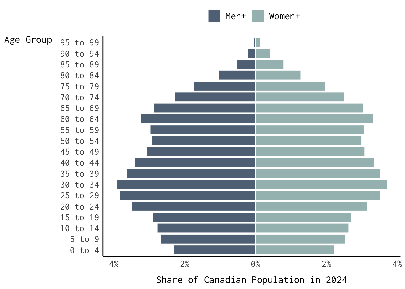
Quick Exercise (Click to Expand and/or Close)
Try subsetting the data and generating a faceted version of the population pyramid displayed above.
Afternoon Exercises
Beginner
Reproduce the plot below using gapminder and the ggthemes package.
Hint (Click to Expand and/or Close)
You may want to subset the data as follows:
gapminder |> filter(year %in% c(1957, 2007),
!continent == "Oceania") 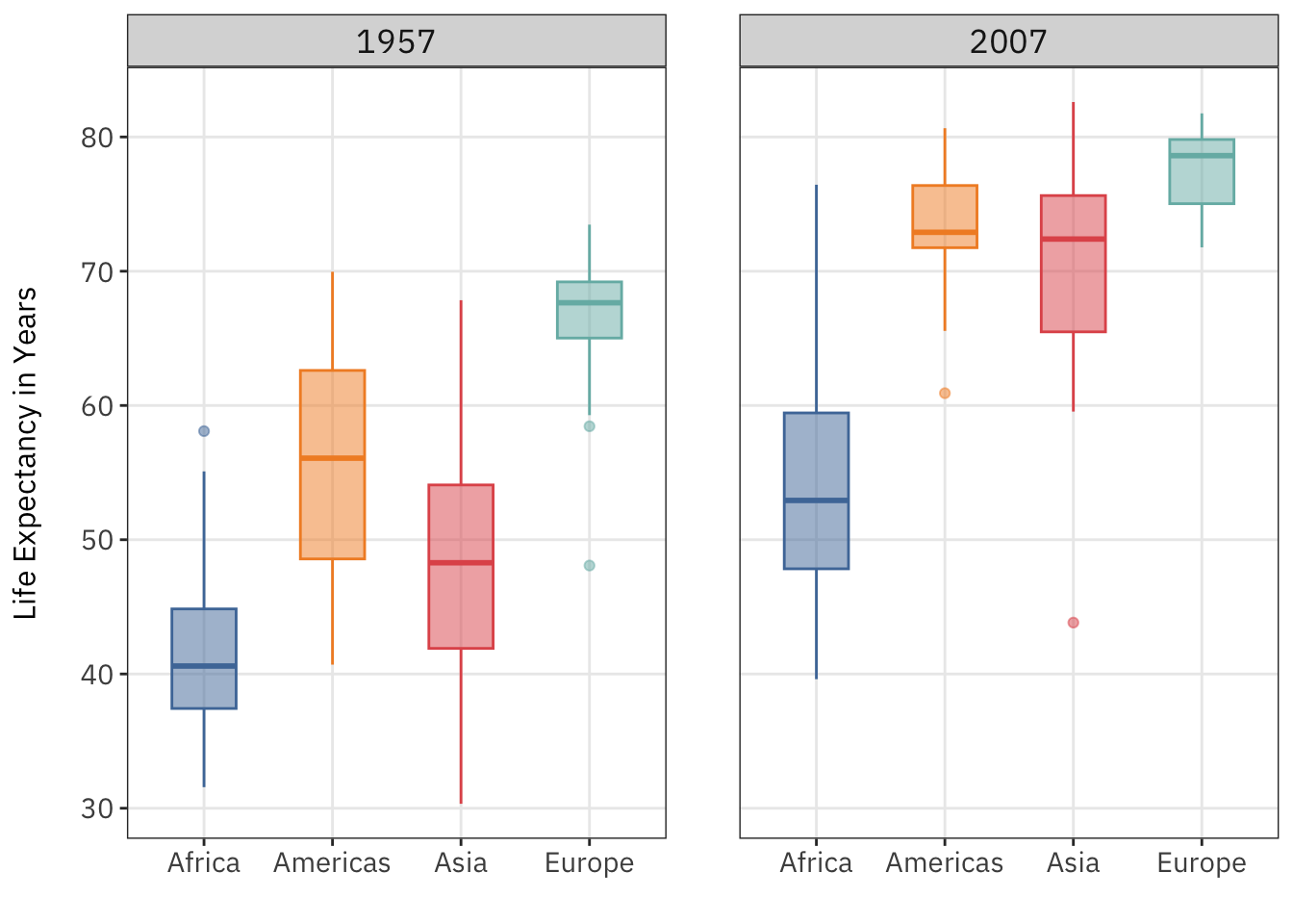
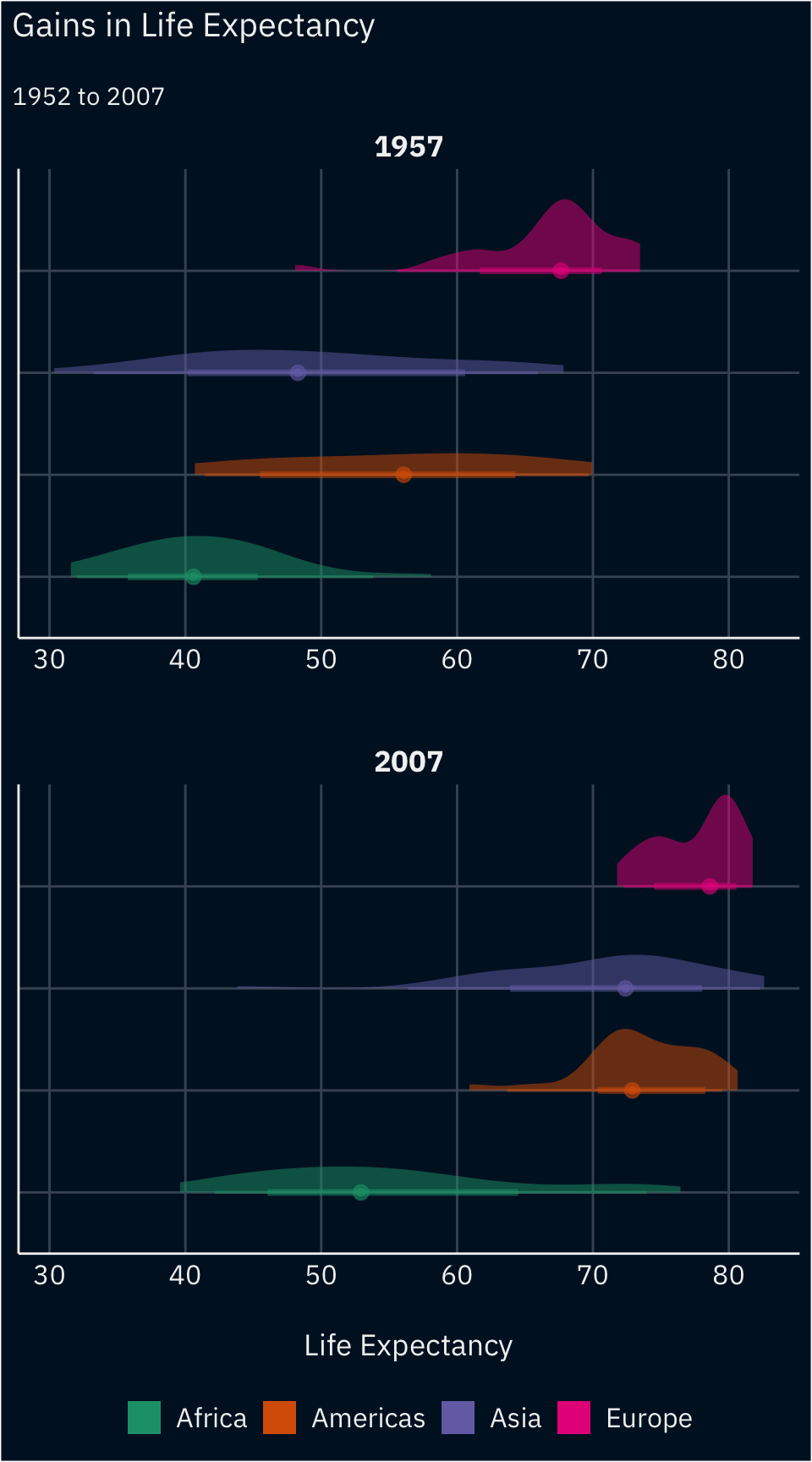
Intermediate
Reproduce the plot below using the see package and geoms from ggdist.
Advanced
Use annotate() and geom_label_repel() to substantially modify one of the plots featured above—at the beginner or intermediate levels—and at least two other visualisations we produced today.
References
Wickham, Hadley. 2009. “A Layered Grammar of Graphics.” Journal of Computational and Graphical Statistics 19 (1): 3–28. https://doi.org/10.1198/jcgs.2009.07098.
Wickham, Hadley, Danielle Navarro, and Thomas Lin Pedersen. 2023. “ggplot2: Elegant Graphics for Data Analysis.” https://ggplot2-book.org/.
Footnotes
That said, you can also copy the source code into your console or editor by clicking the Code button on the top-right of this page and clicking
View Source.↩︎Additional
geom_*elements can be brought into the fold by installingggplot2extensions.↩︎That would be kind of a pain, right?↩︎
Your mileage may vary.↩︎
In the year 2020.↩︎
In a quirky, “Frankenstein’s Monster” kind of way.↩︎
For instance, the bar plots were simple, i.e. untransformed, representations of the life expectancy values in the data set.↩︎
Depending on the number of observations. If \(N\) is less than 1,000, a
loessestimator is used; otherwisestat_smooth()uses a general additive model fit via themgcvpackage.↩︎More concretely, it merges the
palettes_c_namesandpalettes_d_namesdata frames frompaletteer.↩︎